Before we started the renovation of this Cascade ranch style home, it had three things going for it - great architecture, quality hand-crafted trim and cabinetry, and homeowners that trusted there was potential.
Even though the woodwork, cabinetry, and ash wood floors were well-made, one of the biggest goals of the renovation was to minimize the amount of stained wood in the space and overall brighten the home.
FRONT ENTRY
————BEFORE————
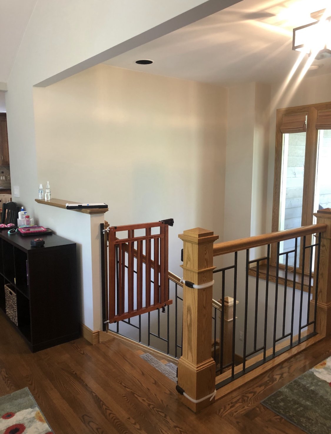
Front entry - before
Front entry - before
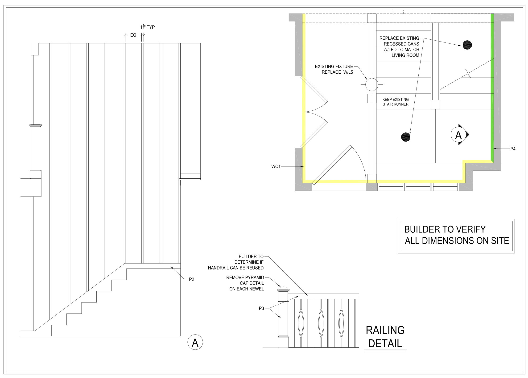
Front entry - initial design rendering
————AFTER————
Stairwell walls can be tricky because they’re often just SO TALL and boring. We opted to make it a bit of a focal point in the space by adding battens and painting it Benjamin Moore Amazon Green which is a rich shade that’s not quite blue or green. We paired this with Mitchell Black Peach on a Vine wallpaper; I love this wallpaper because it’s very subtle, a bit geometric, and gives the walls more of a texture than an in-your-face print.
LIVING ROOM
————BEFORE————
Living room - before
Living room - before
Living room - before
Living room - before
Living room - 3D design rendering
————AFTER————
I loved the vaulted ceiling and amount of natural light, but the windows were made up of two unnecessary sliders that we ultimately replaced with two very large windows. We kept the custom built-ins, but added new doors and gave the fireplace a complete overhaul including a new Heat & Glo insert. We also replaced the ceiling fan and added LED can lighting and sconces on the fireplace. The existing flooring had an inset carpet in the middle of the room (why? Just…why?), so we replaced that with ash wood flooring and had everything sanded and refinished. The size and orientation of the inset carpet was significantly limiting the way furniture could be arranged as it wasn’t a good size for the room.
I love the combination of the Jeffrey Court glass herringbone mosaic and marble Statuario subway tile. The tile almost feels a bit like a knit sweater which is perfect for a warm, cozy space like this one.
DINING ROOM
————BEFORE————
Dining room - before
Dining room - before
————AFTER————
The existing dining room had a lot of potential, but overall felt dark. The new Benjamin Moore Silver Strand walls are a lovely shade of green-gray that compliments the wood cabinetry beautifully along with the Benjamin Moore Steam trim and Chelsea Gray doors. I love this oversized chandelier because it makes a bold statement but doesn’t overpower the room. Everything in this space equally blends form and function. The new dining table combines walnut wood with a durable ceramic top which is perfect for a busy family, and the dining room rug is literally machine washable. Durable doesn’t have to mean boring!
Clippings from outside make for a beautiful center piece.
KITCHEN
————BEFORE————
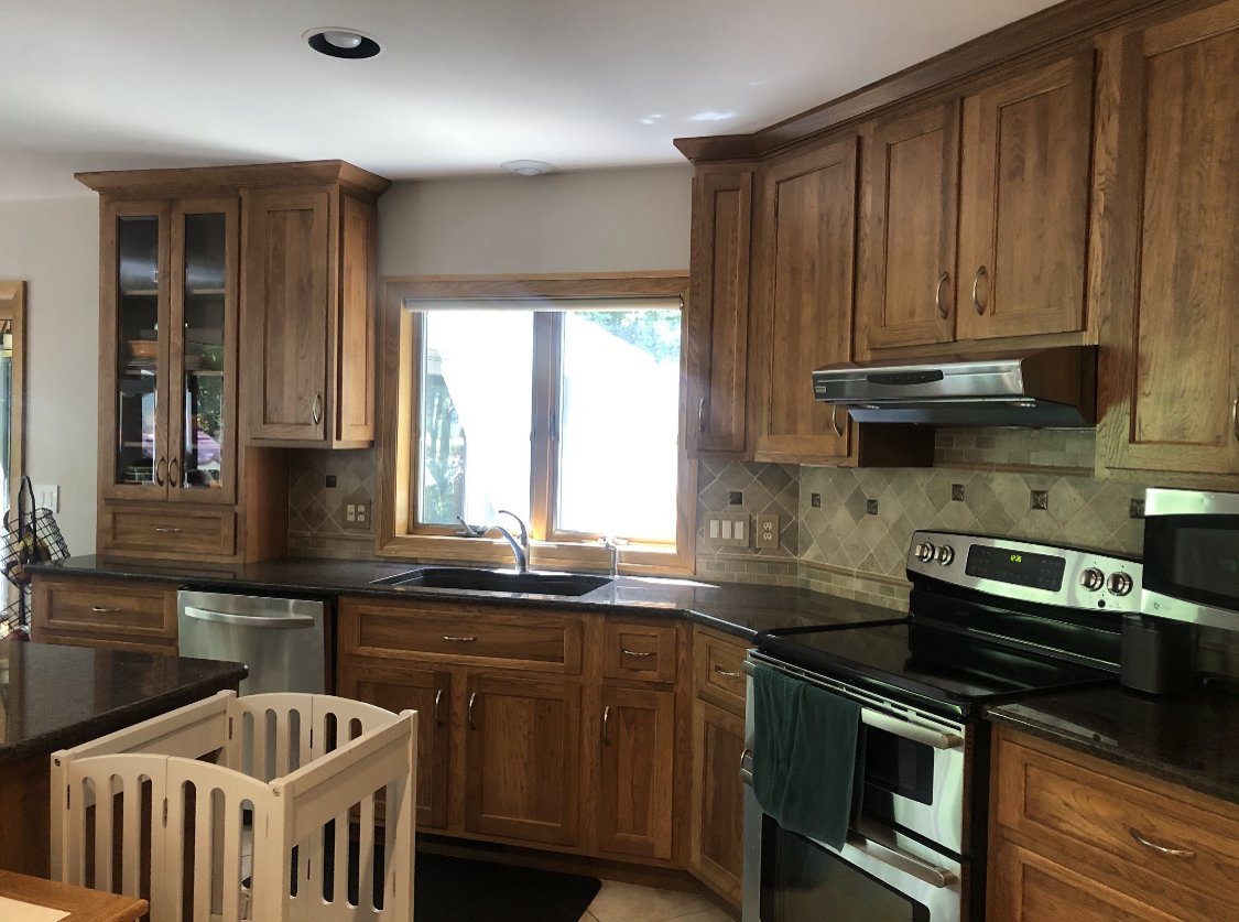
The kitchen cabinets were already really beautiful and well-made, but they were being overshadowed by dated countertops, backsplash, lighting, and flooring.
Kitchen - before
Kitchen - before
We are always looking for ways to communicate design ideas for clients while working with their design budget. 3D renderings are time consuming to create, and thus can often add up quickly cost-wise. Because we were keeping their existing cabinetry, I was able to photoshop an image to show the updated appliances, countertop, backsplash, lighting, and flooring. It’s not nearly as perfect as a 3D rendering would have been, but it was a fraction of the cost to create, and successfully helped communicate our design ideas (with a bit of squinting, of course).
Kitchen - photoshopped image to communicate design concepts
————AFTER————
I love this warm, inviting kitchen. All of the appliances were replaced with GE Cafe appliances which is quickly becoming my new favorite line. We extended the tile backsplash up to the ceiling above the window and added a custom roman shade. We also extended the wood flooring into the kitchen, so it flows more seamlessly with the surrounding spaces.
MUDROOM / LAUNDRY ROOM
————BEFORE————
This uniquely shaped room is a hard-working little space! Located just off the kitchen, it previously served as the mudroom, laundry room, AND powder bath, but none of them were really functioning well. You can see from our layout below just how tight the room really is, so the homeowners opted to remove the toilet from the room to free up space for a better functioning mudroom and laundry room.
Mudroom/powder bath/laundry room - before
Mudroom/powder bath/laundry room - before
———— AFTER ————
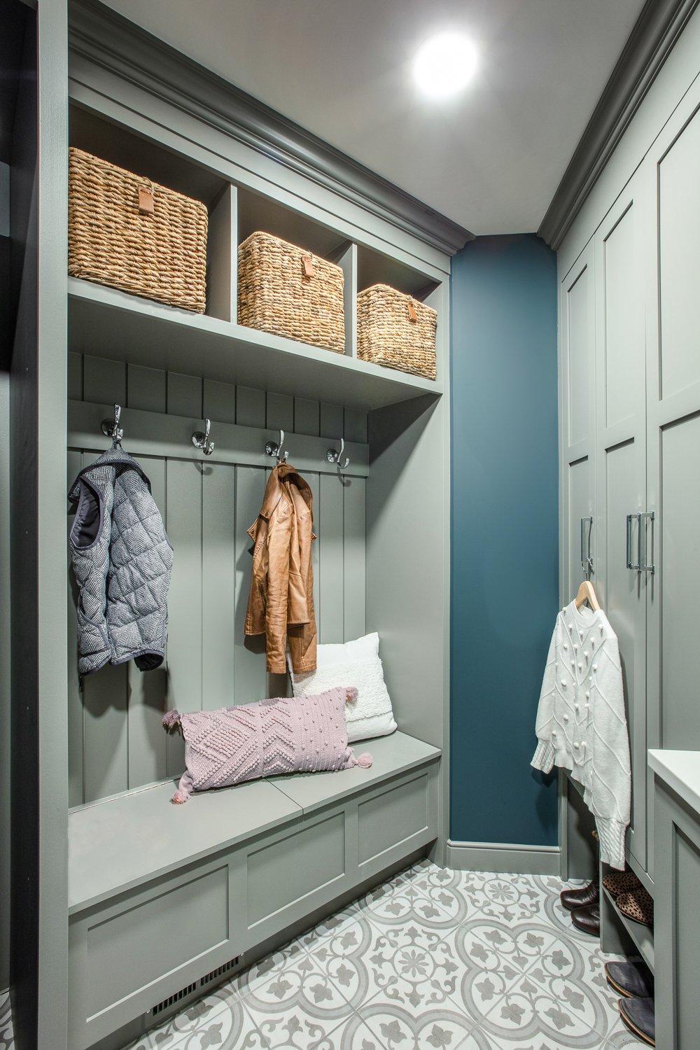
The perfect laundry room needs 5 things: A sink, a trash pull-out, drying racks, a hanging rod, and a combination of open and closed storage. (More on designing the perfect laundry room here!) This room may be small, but it HAS IT ALL!
The drawings above showcase the extensive planning and details that went into making this space functional. By stacking the washer and dryer, we were able to free up space for a nice long bench which has lift up lids with storage inside. These lids use a slow closing hinge, so they don’t pinch little fingers while serving as an easily accessible space for kids to throw mittens and hats all winter long. The bench is perfect for sitting down to put shoes on as well as for setting down laundry baskets. The cubbies above have baskets for out-of-season items.
Adjacent to that wall, there’s ample closed-in storage for cleaning products as well as shoe cubbies and a laundry sink with trash pull-out and hanging rod above. Next to that, we were able to squeeze in two pullout drying racks which I have in my own home, and LOVE!
Design wise, we went bold because - why not!? The Chelsea Gray cabinetry matches the doors and windows in the rest of the home, and the walls are the same Amazon Green as the foyer wall and living room fireplace. I love finding new ways to weave the same colors into new spaces, so the palette flows throughout without feeling repetitive.
I love how this home came together almost as much as I loved working with the kind people that live there. Every home I design makes me feel so fortunate to do what I love while simultaneously growing a business and supporting my family. Using ‘love’ three times in two sentences… overkill? Absolutely not.


