A little over 2 years ago, I moved into my first commercial office space. Prior to that, I worked out of my home office for a few years, but thanks to amazing projects and a growing company, I was fortunate to call 800 sq ft of office space mine.
Fast forward to January 2017, and my husband Justin started Fox Consulting Group - a digital strategy and analytics consulting firm. Working from the home office worked really well for him during the first year, but as soon as Fox Consulting started to grow, and Justin's team was working from the Fuchsia Design conference table, we knew it was time to expand our office space.
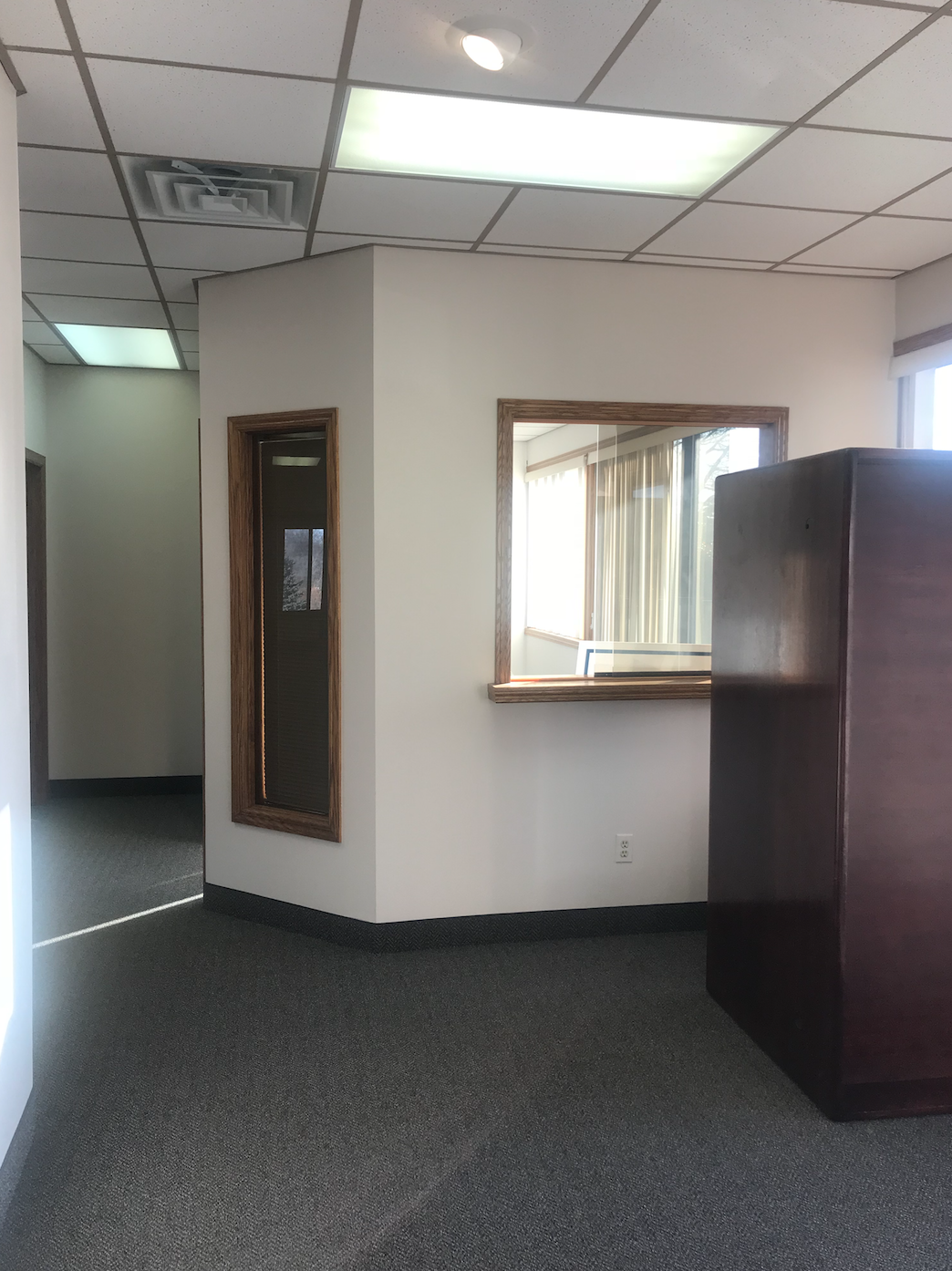
In March we began construction on our new 2,000 sq ft office space. This unit had been empty for a long time and for good reason. Not only did it have a drop ceiling, dated commercial carpet, and oak doors, trim, and cabinetry, it had far too many walls with small, closed-in interior rooms.
This video is from the very first time we toured our new office. I'd be lying if I said I saw this space working out during this walked through; even I had a hard time looking past the dark, tight layout. But, in true Fuchsia Design fashion, I studied the floor plan and came up with a layout that surprisingly fit every need we had in an office.
FLOOR PLAN - BEFORE
FLOOR PLAN - AFTER
In hindsight, we didn't remove that many walls, but the ones we did made a huge difference. In the back, we removed the walls that closed in the new conference room and lounge area. We also added an opening into the kitchenette, reduced the number of team offices from 3 to 2, and took out a lot of doors for a more open concept office. Even though a lot of the work was done by contractors prior to us moving in on May 1st, we still had quite the To Do list once getting full access to our new office.
Let's start the tour in the front entry foyer.
--FOYER--
BEFORE
DURING - Drywall was delivered, drop ceiling was removed
DURING- electrical and drywall work in progress
DURING
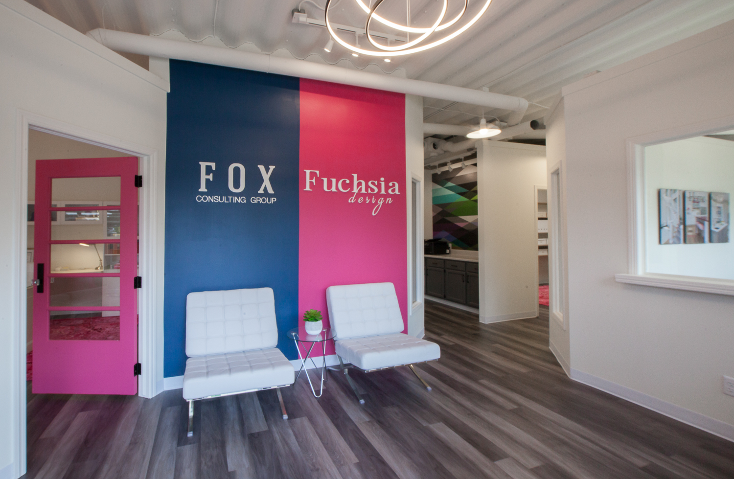
DURING - lighting fixtures and wallcovering installed
And here's the completed foyer space!
--Autumn's Office--
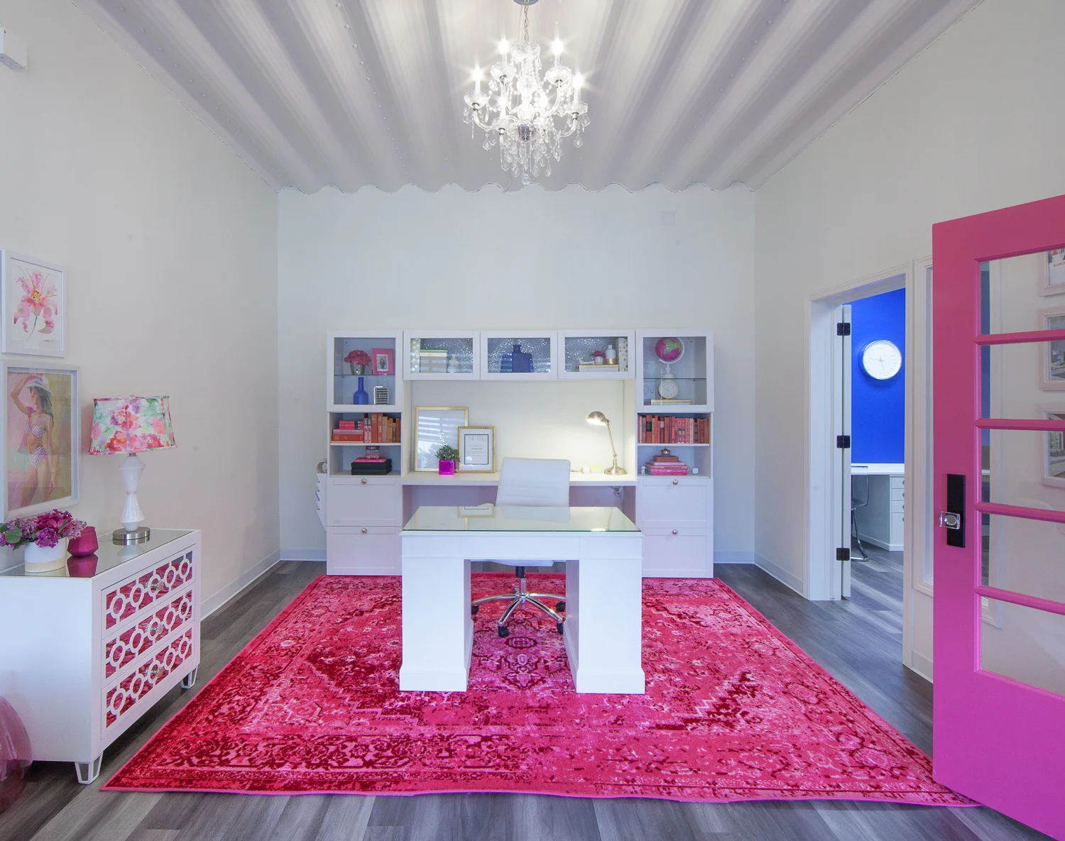
Through the fuchsia door in the foyer is my office. I love all of the natural light in this space, and the seating area is a nice addition, too! Here are some before and during photos of how the space progressed.
Before
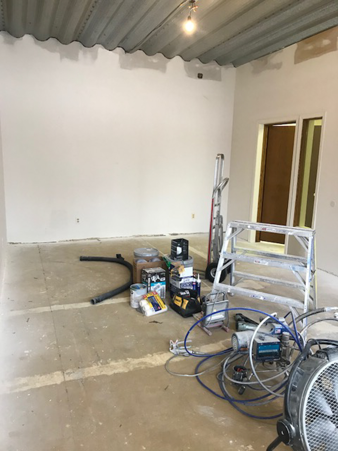
During - painting starting soon
During - Drop ceiling and commercial carpet removed
During - painting starting soon
During - fresh coat of white paint on everything
Are you ready to see the end result?
--Team Offices--
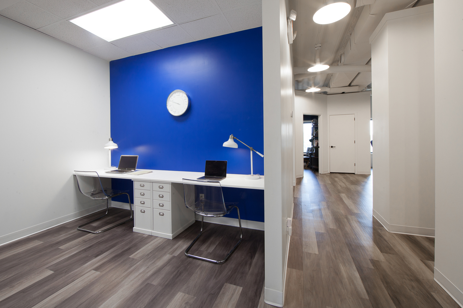
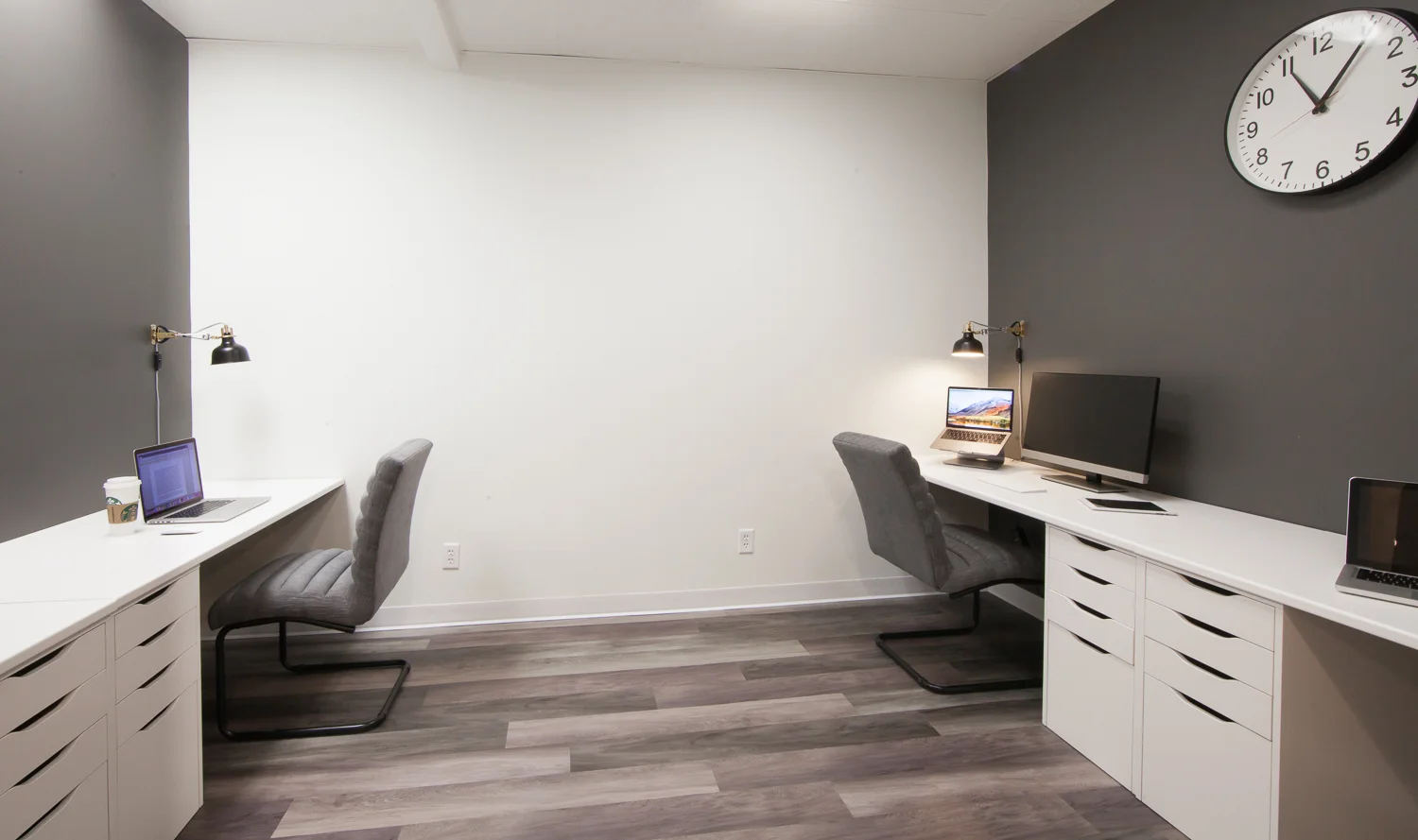
We added the doorway between my office and my team's office to give easy access and collaboration between our spaces. It also really helped with the traffic flow so that I don't have to go through the front foyer to get to the rest of the office space. Adjacent to the Fuchsia Design team office is the Fox Consulting Group team office. If you recall, there were three small offices all closed in with doors prior to move in, so we reduced that to two larger spaces, removed the doors, and raised the door openings to significantly open the spaces.
Before - closed in with oak doors
During - walls coming down to make three offices into two
During - new wall up to create the new team office spaces
And here's the end result for our team offices!
Fuchsia Design Team Office
Fuchsia Design Team Office
Fuchsia Design Team Office
Print Station Outside Team Offices
Print Station Outside Team Offices
Fox Consulting Group Team Office
Fox Consulting Group Team Office
-Fuchsia Design Conference Room-
The Fuchsia Design conference room is an extremely important space - it's where our clients go to select all of the finishes and selections for their home. It was vital that the space have ample natural light.
BEFORE - Look at all of that gorgeous morning light pouring in through those hideous vertical blinds!
DURING - Drop ceiling removed
DURING - Updated electrical being installed
And here's the completed space!
Look at all of the natural light!
--Resource Room--
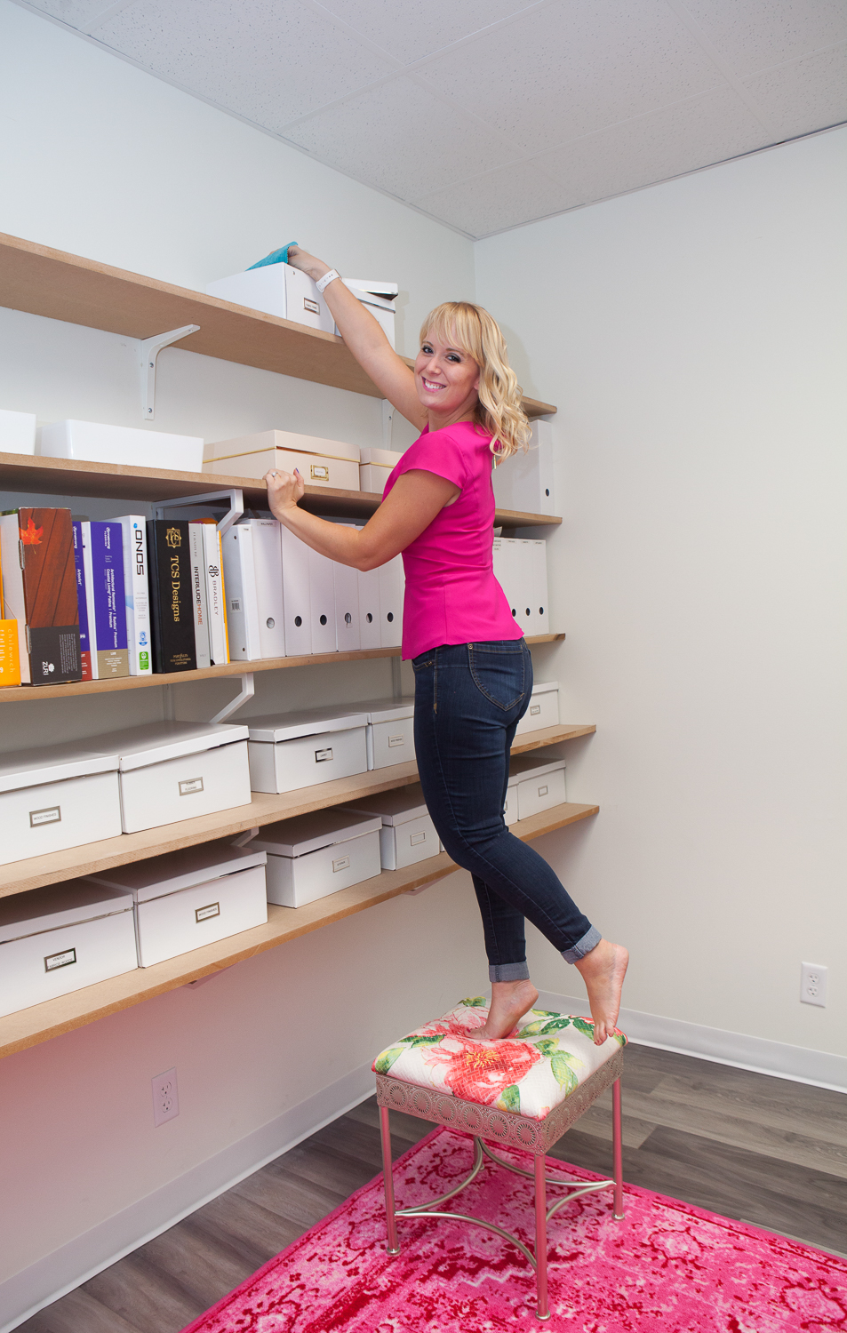
This room isn't the prettiest room in the office, but it is one of the most important. The resource room is the space that houses all of our samples, organizes client materials and selections, and serves as a space to lay out preliminary designs. This space is great because it still has plenty of room to grow into as we continue to grow over the next five years.
BEFORE
--COMMON ROOM--
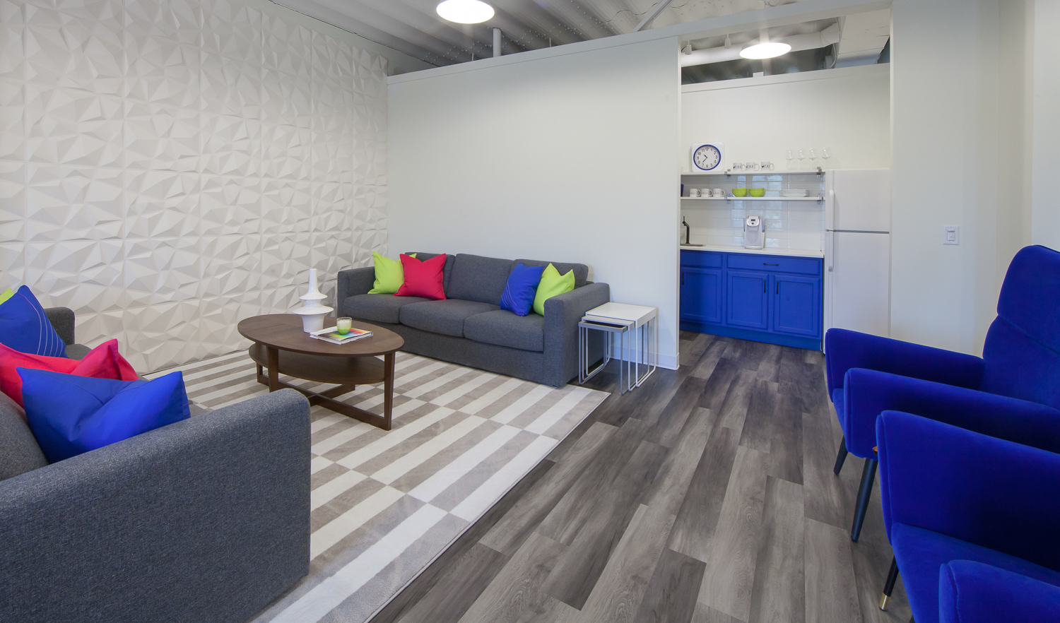
We wanted a common lounge area in our new office that both of our teams could work together in and hang out during lunch. Prior to construction, this space consisted of two closed-in rooms and a hallway. Opening it up really allowed the natural light to pour into the back half of our office space.
Before - Hallway leading to the two private spaces that we opened up
Before - The hallway of a million doors.
Before - Here's Justin removing a ceiling tile to see what was above the drop ceiling to know if we could remove it or not. This was a pivotal moment in the initial office tour.
TIMBER! Walls down and drop ceiling out.
This is now the common area with a textured wall and two sofas
If I squint, I can see the potential. Can you?
Here's the end result!
This multi-purpose area serves as a comfortable work space, as Fox's conference room, as a presentation area for teaching workshops, and as our lunch table.
Tyler from Great Lakes Fire Pit and Patio (instagram @tylermakesit) made us this incredible custom walnut conference table.
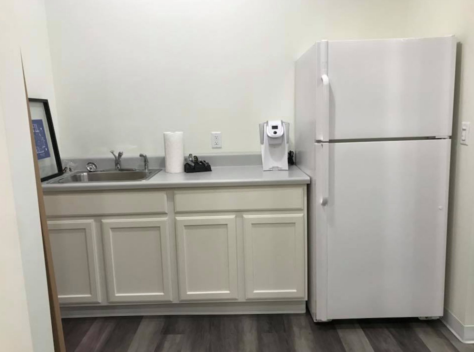
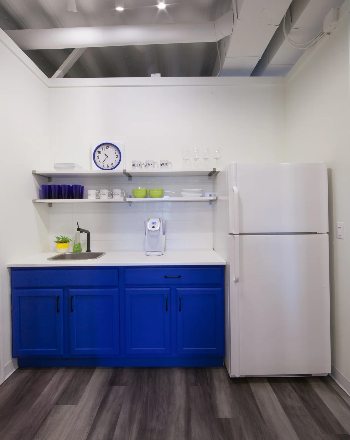
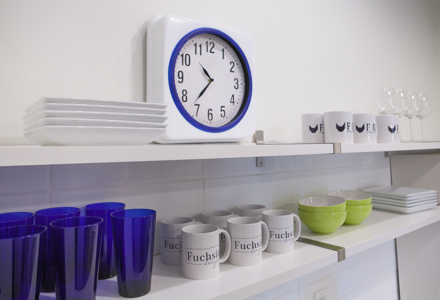
Adjacent to the common area is the kitchenette. This space was so drab during our initial walkthrough.
Before - The upper cabinets definitely had to go.
During -. The oak was begging to be painted.
Also on the chopping block - countertop, sink, faucet.
And.... VIOLA!
Here's some before and after of the bathroom. It was such a boring commercial bathroom.
Before - On the chopping block ... everything.
During - I was having doubts at this point if this bathroom could ever feel anything other than gross.
We used the same wallpaper from above the print station, installed a new floating vanity, wall sconce, mirror, artwork, toilet, vinyl base, and flooring. So - basically everything except those grab bars got replaced!
--Justin's Office--
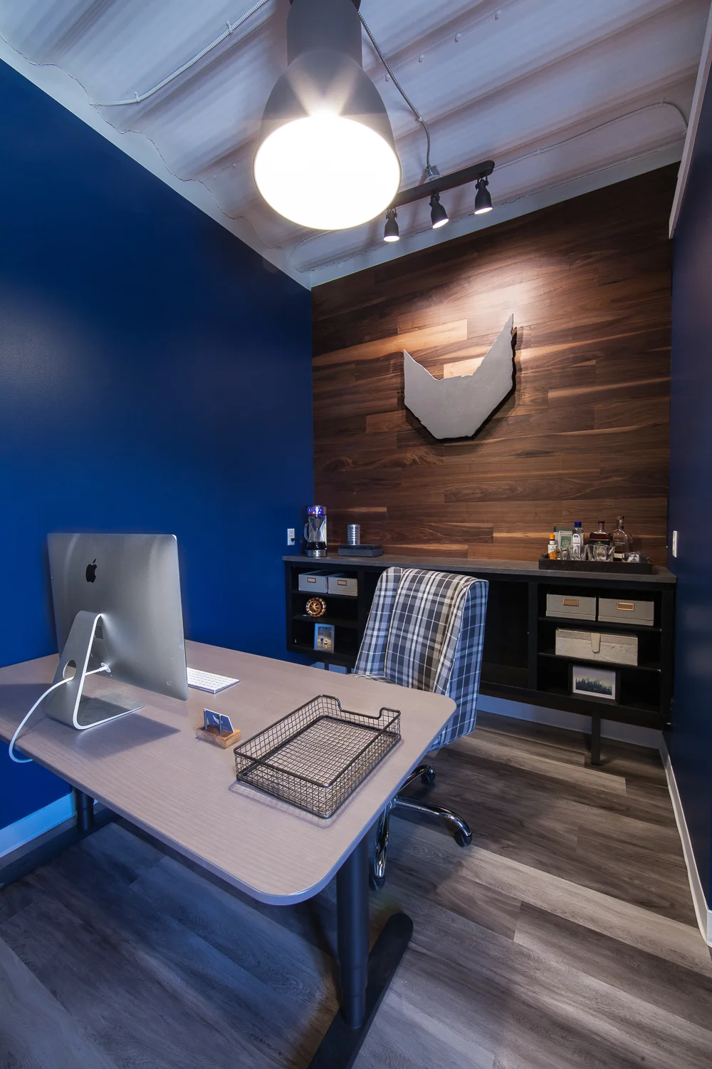
With all of the pink in my office, I really wanted to make sure that I designed an office space for Justin that truly represented him and his personality. I decided to mix masculine and industrial with walnut, navy, and gray, and I'm so happy we were able to achieve this unique office space for him - especially considering the drab space we started with.
Justin's office -. before
Justin's Office - Before
Justin's office - during
And here it is! The end result of Justin's private office -
So, that's the whole office! We feel so fortunate to have found this space, to be able to come here and work everyday, and to be building companies that we're passionate about. What's your favorite space?
