Ready for the FINAL lake house blog post?! It’s bedroom reveal day for the 4 bedrooms on the second level. Bedrooms are so much fun to design. I’m all about continuity throughout a home, but there’s something about a bedroom that allows us to do something special and unique to just that room.
---KIDS BEDROOMS---
When it comes to kid’s bedrooms, I’m not a huge fan of ‘themes’. Sure, it should be a space that represents the child’s personality and interests, but it should also be something that they can easily grow into by switching out a few pieces like bedding or artwork. This family has three children, and it was important to me to treat each space as an individual reflection of each child – rather than make each one the same.
Let’s start in the 11-year-old boy’s bedroom. This boy loves to travel and read. He’s a bit of an old soul. I wanted his room to feel worldly and sophisticated, yet age appropriate for an 11-year-old and something he would still love when he’s 18.
Here’s some concept renderings from the initial design along with some progress photos.
---BOY'S BEDROOM---
September 2016
April 2017 progress photos above
And here’s the final result! The first thing I found when I started designing this space was the felted pinstripe wallpaper on the headboard bed wall, and I loved that it felt like a fabric from men’s suiting. That, paired with dark knotty alder set the stage for the room. I love all the metal airplanes we found to fill the shelves along with his books and storage bins for his things.
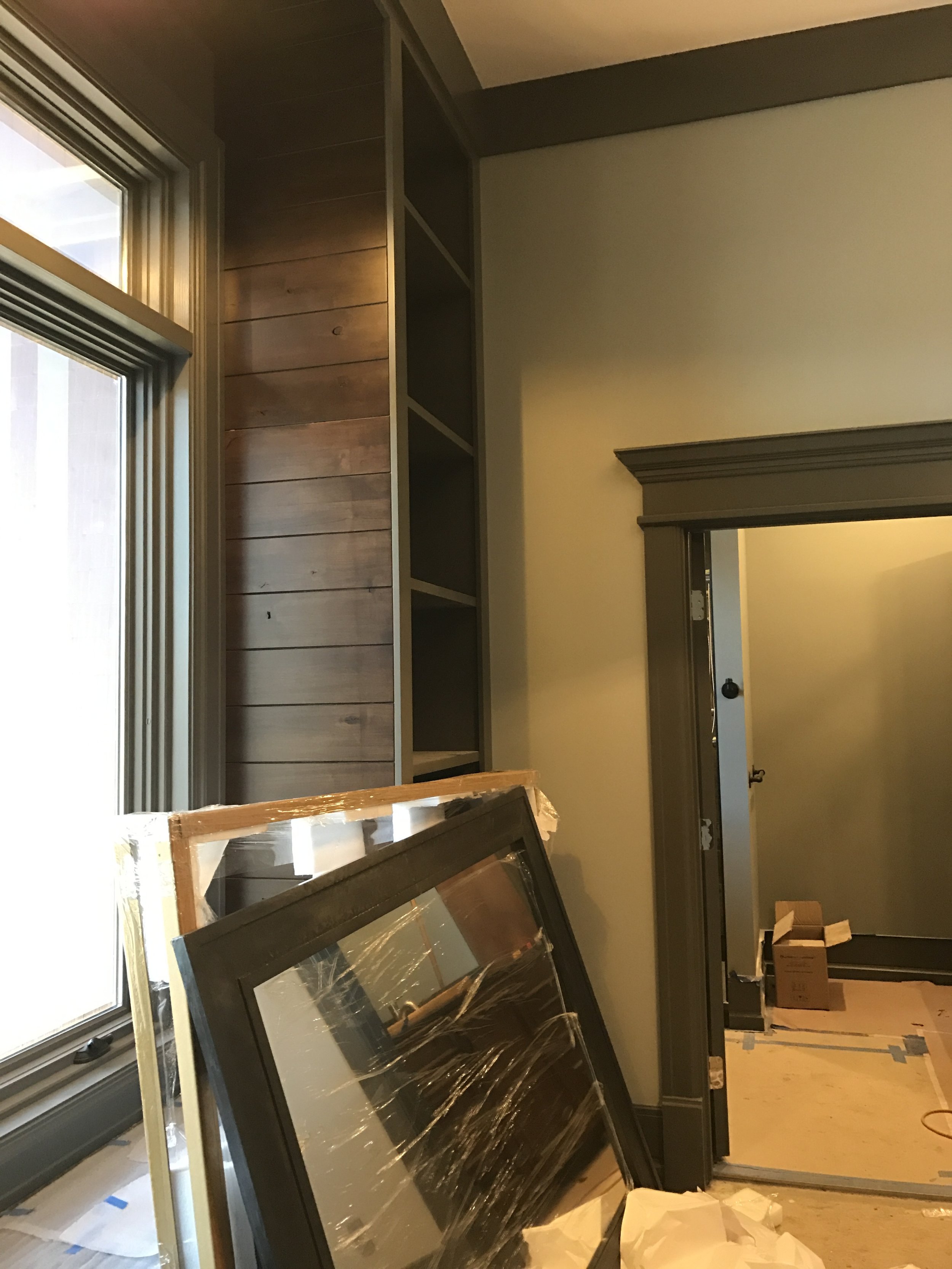
Each kid’s bedroom also has a walk-in closet and a full bathroom attached. For his bathroom, I continued with the knotty alder and introduced slate tile stacked in rows that varied between 4" high and 12" high, along with a streamline sliding glass door. I also love the leather pulls on the vanity that feel like they're from a suitcase. This is the perfect example of a design detail that gives a hint to travel, but they're not so literal and themed that he'll grow out of it.
---GIRL'S BEDROOM #1---
In the next bedroom over is for the 7-year-old girl. This is the most unique little girl’s bedroom I have ever designed. How does one combine feminine and cutesy with HUNTING!? That’s right – this little 7-year-old girl loves to hunt with her dad and even shot her first buck last winter.
Here’s the initial concept renderings and progress photos.
September 2016
April 2017 - bedroom vestibule
April 2017
Again, I started with the wallpaper for inspiration and direction. This particular wallpaper is nearly impossible to photograph, but in person, it looks like birch bark with a metallic background. It was the perfect mix of glitz and earthy. I love this rustic poster bed from RH Teen, and we mixed in the antler chandelier, alligator texture carpet, fur pillows/rug, and antelope hide window seat as subtle hints to her wildlife personality. The pops of teal and light purple were a great way to keep this room girly and age appropriate.
I’m completely smitten with how the bathroom turned out. The wood tile wall paired with the dark gray cabinetry and white countertop is so crisp, and the floor is beyond fun. I didn’t want a big mirror to cover the whole tile wall, so I chose this narrow mirror to reflect the same size and shape as the window. I love that she will easily grow into this space in the many years to come. Oh, and the lavender hand soap? Okay, maybe I went a little crazy with the details, but no detail is ever too small.
---GIRL'S BEDROOM #3---
The next bedroom over is the 9-year-old girl’s bedroom. She is definitely the girly-girl of the family (well, along with her mama!). She loves color and all things feminine.
September 2016
November 2016 - Bedroom vestibule
March 2017
May 2017
May 2017
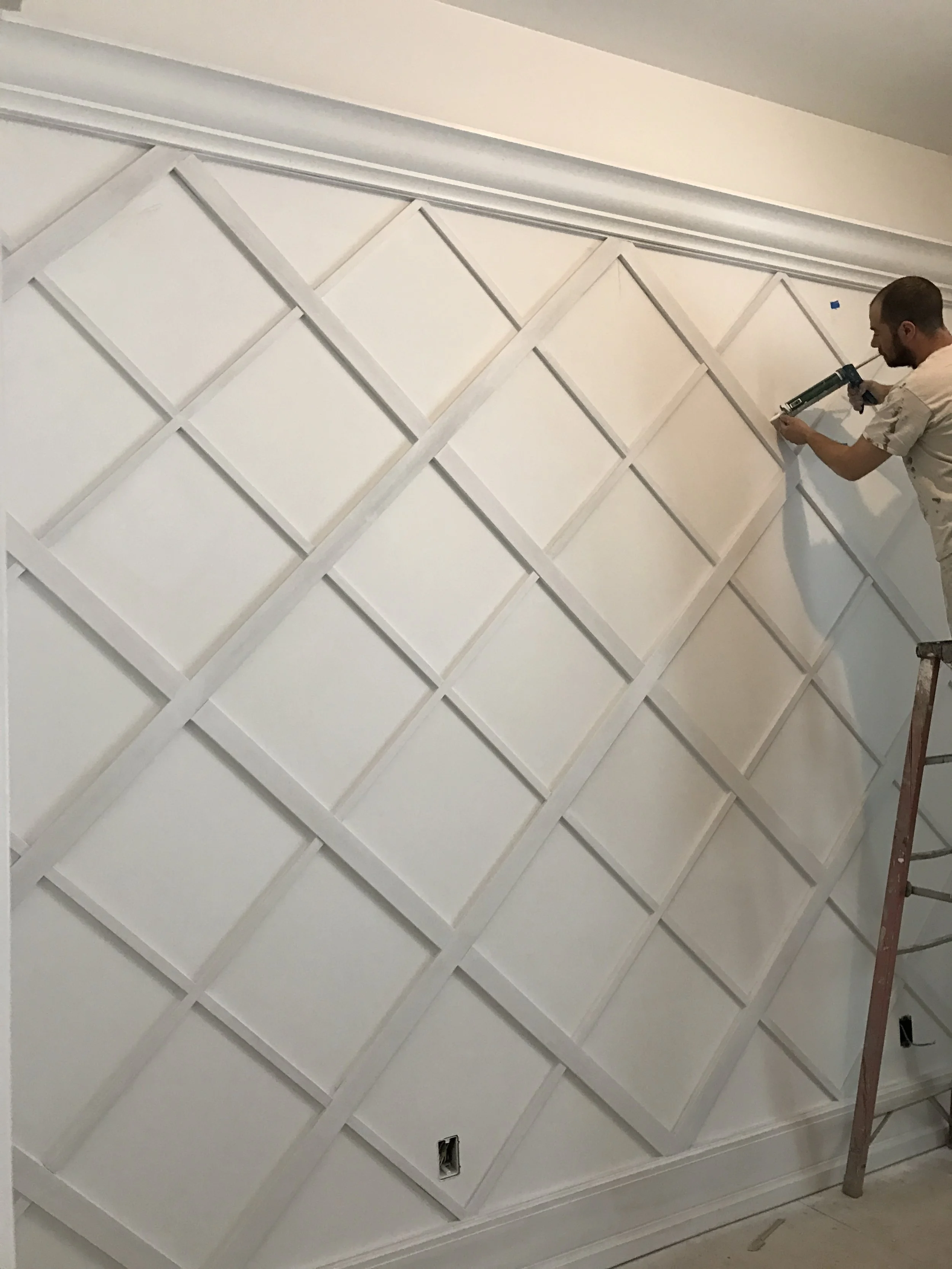
With the 12’ ceilings, I instantly knew that I wanted to do crown molding around the room at 10’ and paint the ceiling and top 2 feet of the wall a fun color. Not only does this bring the ceiling height down visually to make the room cozier, but it also allows there to be MORE color than just the ceiling which could easily get lost because it’s so high off the ground. We chose coral and decided to do the same color on the vanity in her bathroom. I loved the idea of doing a built-in vanity for when she gets older and wants to do her hair or put on make-up, and the argyle trimmed wall was a crazy idea I’ve had that was fun to see come to fruition. On the opposite wall is a picture collage wall with ledges where she will easily be able to switch the pictures out as she gets older. For now, it’s a fun way to frame in the tv and add her personality to the wall.
Here's some fun progress photos of the bathroom:
April 2016
January 2017 - This photo shows the quilt tile nicely
May 2017
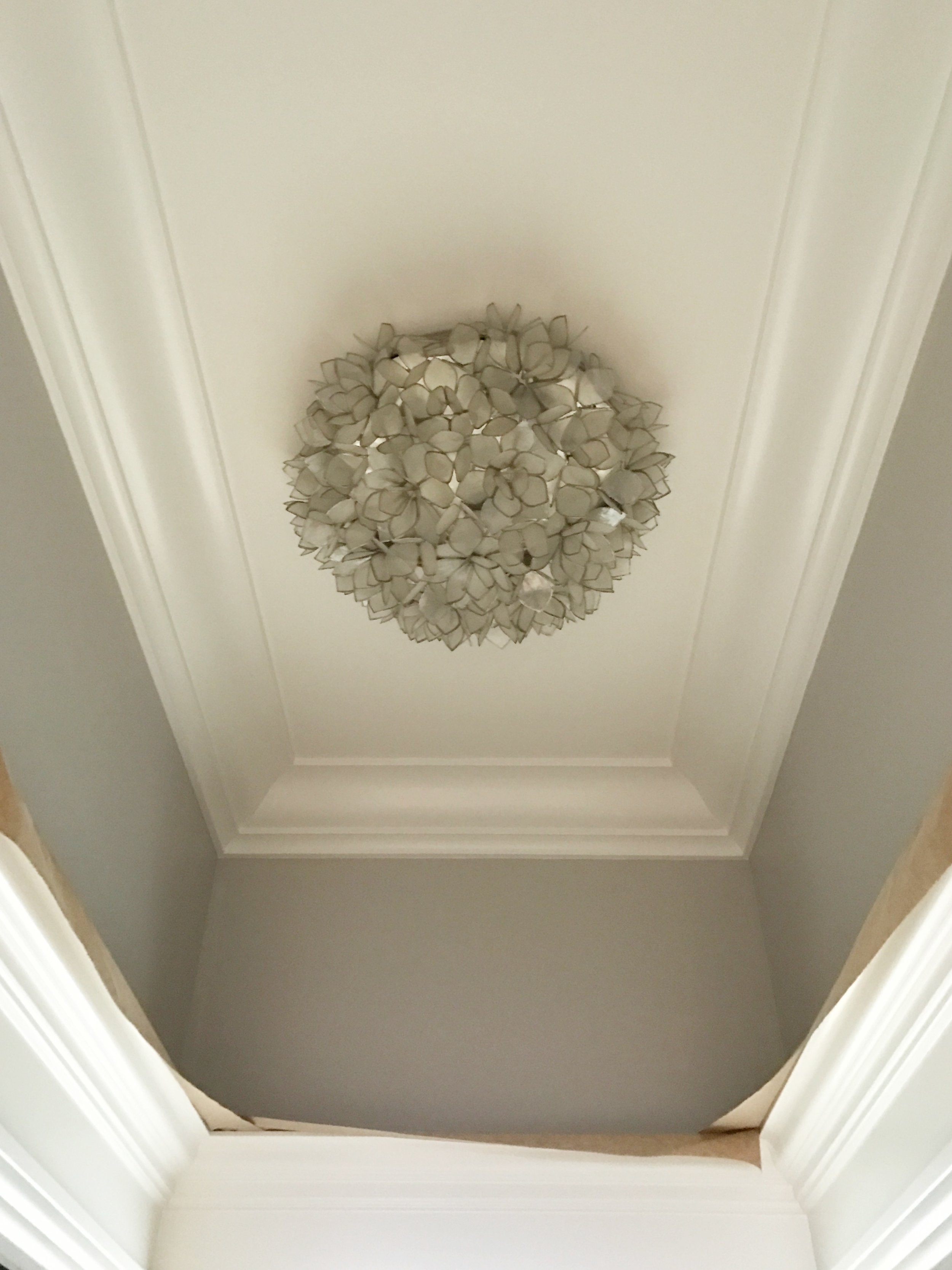
In the bathroom – that heart in the tile floor makes the heart in my chest explode. The designs you can do with penny tile are pretty much endless. Also, the pendant hanging in the bedroom has little black hearts on it, so it ties in nicely with that detail. The tile in the shower is fun too; up close it feels like a quilt. The Silestone countertop has flecks of sparkly glass, and it’s just all-around a feminine, pretty room.
---GUEST SUITE---
On the opposite end of the second floor is the guest suite. Here’s the concept I started with –
September 2016
I wanted to give this room a hint of traditionalism while mixing it with cool tones of green, blue, and gray. The first thing I found was the bedding, and I loved mixing prints and textures (those custom draperies!) with the more rustic features like the authentic barn beams I flanked the bed with. The walls are a gorgeous small print, tone-on-tone blue floral wallcovering (that’s hard to see in photos), and the blue ceiling really makes the crown molding pop!
The metallic pinstripe wallpaper in the guest bathroom is to die for, and I can’t get enough of the marble shower with sliding glass door. The tile floor has a nubby texture that reminds me of a cozy sweater. Plus, the semi-opaque chocolate stain on the maple cabinet is like suede; it's as smooth as butter. Weird analogy? Okay. Needless to say, this suite has everything a guest needs to feel at home.
December 2016
So - that's it! That's the whole house! What do you think? Which room was your favorite? I could never pick just one. Would a parent pick a favorite child? Maybe secretly, but they'd never admit it out loud. Ha! Every room has my heart, and there's little details in each space that I love. What a joy it was to create. Thanks for reading, friend.
** 'After' photos by: Ashley Avila Photography


