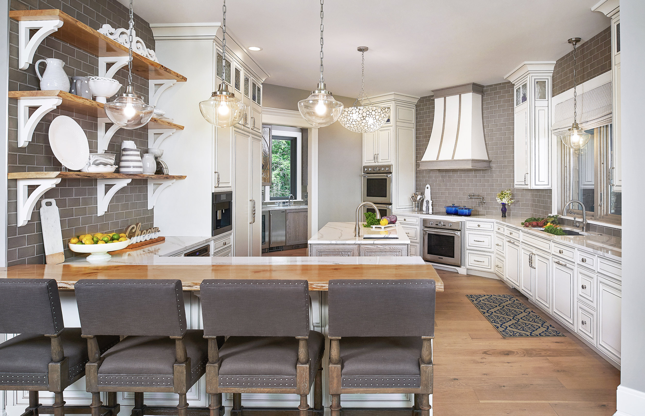
The lakehouse kitchen is right off of the open concept great room and dining room on the third level of this home. Yes, you read that correct – the kitchen is on the THIRD level. The floor plan is unique because while the house is set into a dune, the first two levels have dune views and the third level has a view of Lake Michigan. So, all of the key spaces like the great room, dining room, kitchen, and master suite are up on the third level.
*Thanks goodness for an elevator when it comes to carrying in groceries!
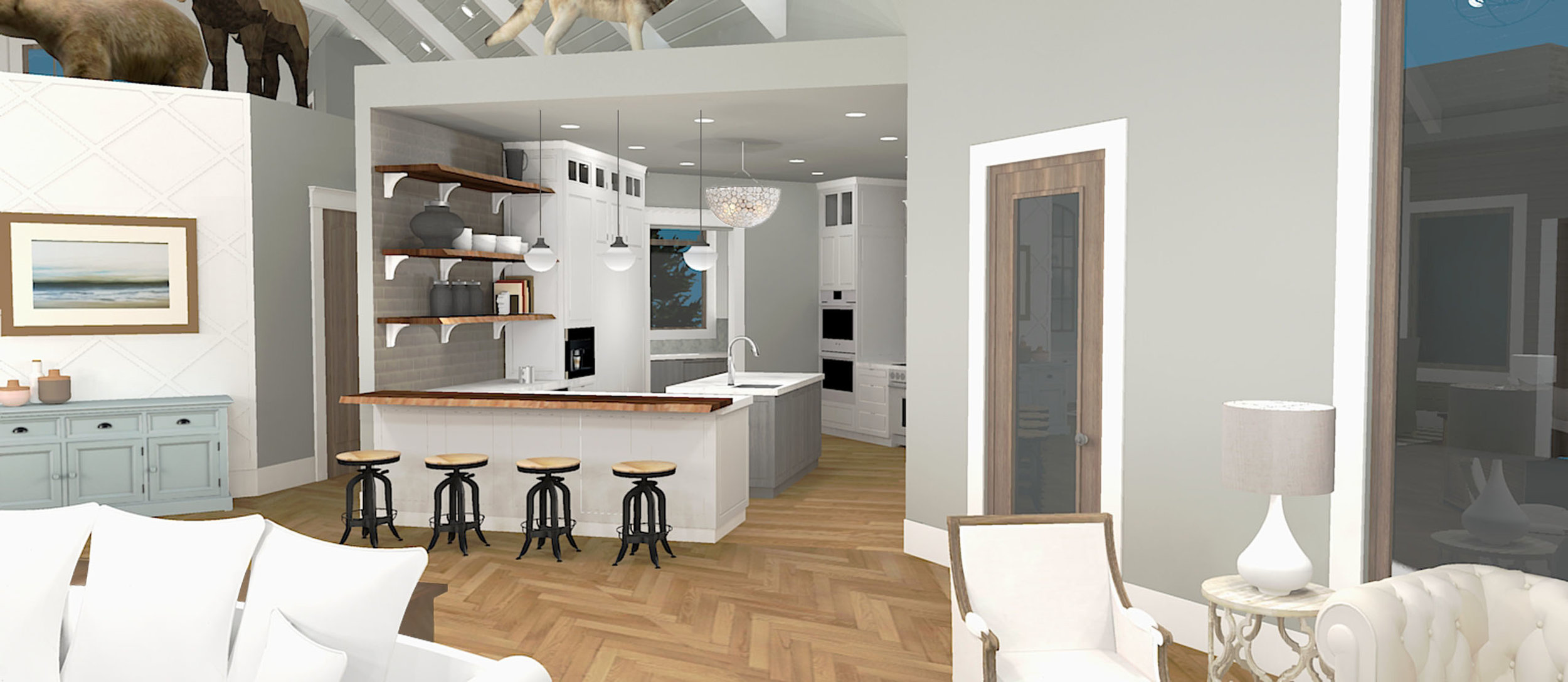
While the vaulted ceilings (that we revealed a few days ago in the great room post) are stunning, the kitchen, pantry, and powder bath all have 10’ high platforms on top of them. Initially, these were going to have wildlife scenes on top of them as the homeowner is an avid hunter. However, as the design of the space evolved and it became a bright and contemporary space, we decided that the animals were best kept in the ‘man cave’ and to leave the platforms empty. I love how the architecture creates space within space. See it back there?
Let's start by taking a look at the initial concept renderings.
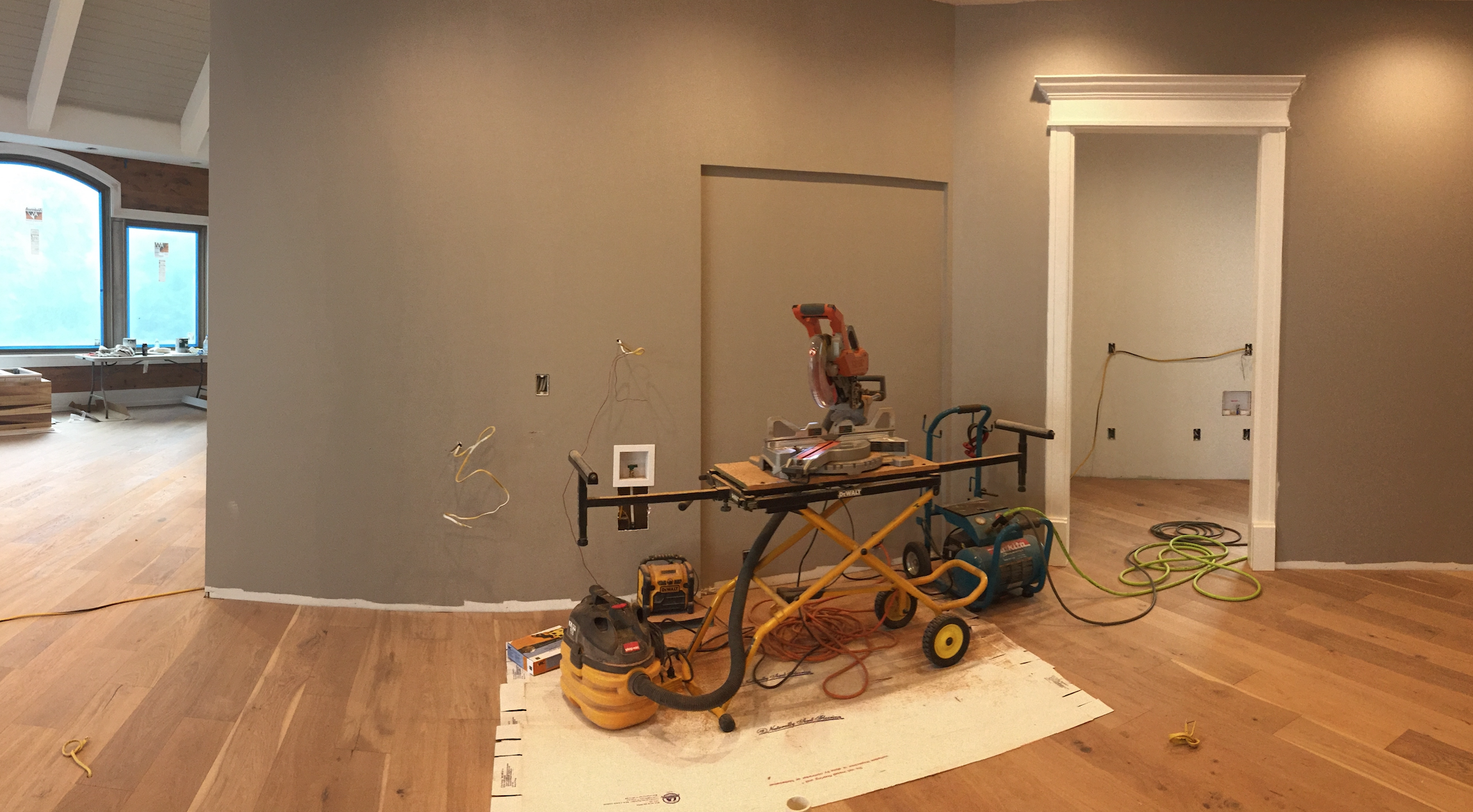
Here's a few progress photos from last September.
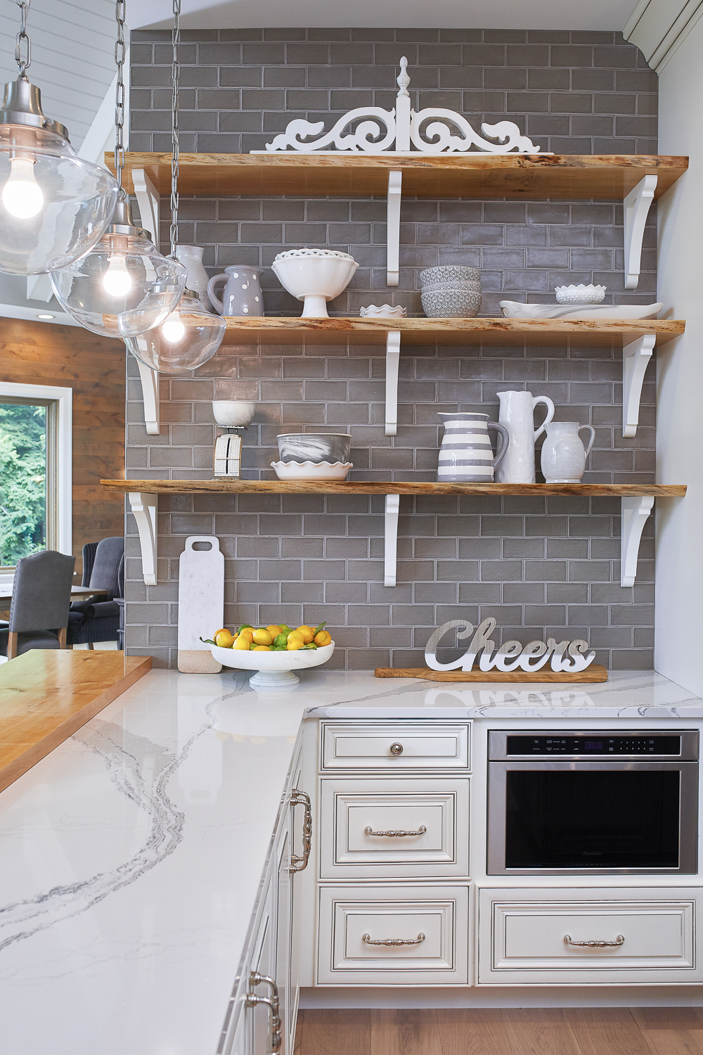
During my initial conversations with the homeowner, she told me she loved spaces that were light and bright with pops of color (a woman after my own heart…match made in heaven.). While she is drawn to pretty, sparkly details, her husband has a more rustic taste and so we strived to combine elements of both styles (but of course, leaning more heavily on the wife’s preferences because – happy wife, happy life). The hand-scraped bleached oak flooring, live edge maple countertop and shelving, and knotty alder ceiling in the hallway are a few of the rustic features we worked in. The pewter glazed white cabinetry, polished nickel hardware, and quartz countertop made this space elegant and classy. As the builder put it, “I’ve been building homes for 30 years, and this is one of the top three prettiest kitchens I have ever built”. So kind. Simply put, this kitchen truly is pretty.
Just off of the kitchen is a large walk-in pantry with side-by-side refrigerator and freezer for additional food storage and floor to ceiling open shelving. In the heat of the photoshoot, it completely slipped my mind to get a photo of this gorgeous space, but take my word for it - there's a ton more storage.
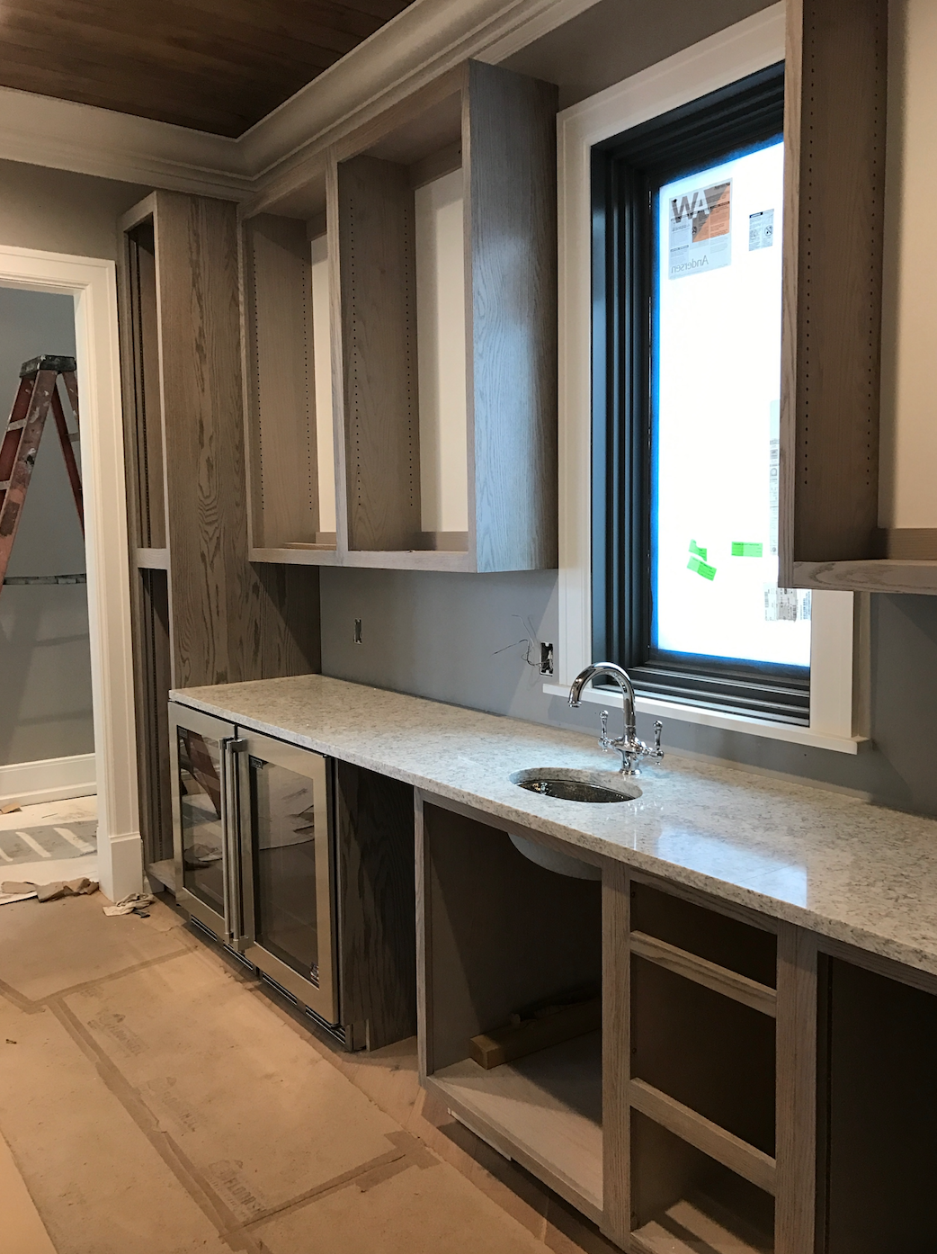
Also off the kitchen is the third story wet bar. This space is perfect for storing tons of barware as well as a collection of cobalt glass, and it's beautifully highlighted by the in-cabinet lighting. It also includes every bar accessories and feature needed to make the perfect drink like a sink, beverage cooler, wine cooler, and ice maker. The black glazed, gray washed red oak cabinetry is the same finish and ties in beautifully with the island and hood in the kitchen, and the rain glass cabinet fronts and antique mirrored backsplash are the cherry on top for this space! Oh! And the knotty alder ceiling with crown molding! Oh! And the bleached white oak floors! Oh! And the quartz countertops. Okay, I love everything about this space. Let's first take a look at the concept rendering and some progress photos:
September 2016
March 2017
And here's the final space!
Next to the wet bar is a huge window seat and some additional built in shelving. When we did our concept rendering, we did one view that showed the entire wall in this hallway:
Third Level Hallway: Concept Rendering from Sketchup
Third Level Hallway: Concept Rendering from Sketchup
Progress shot of third level hallway
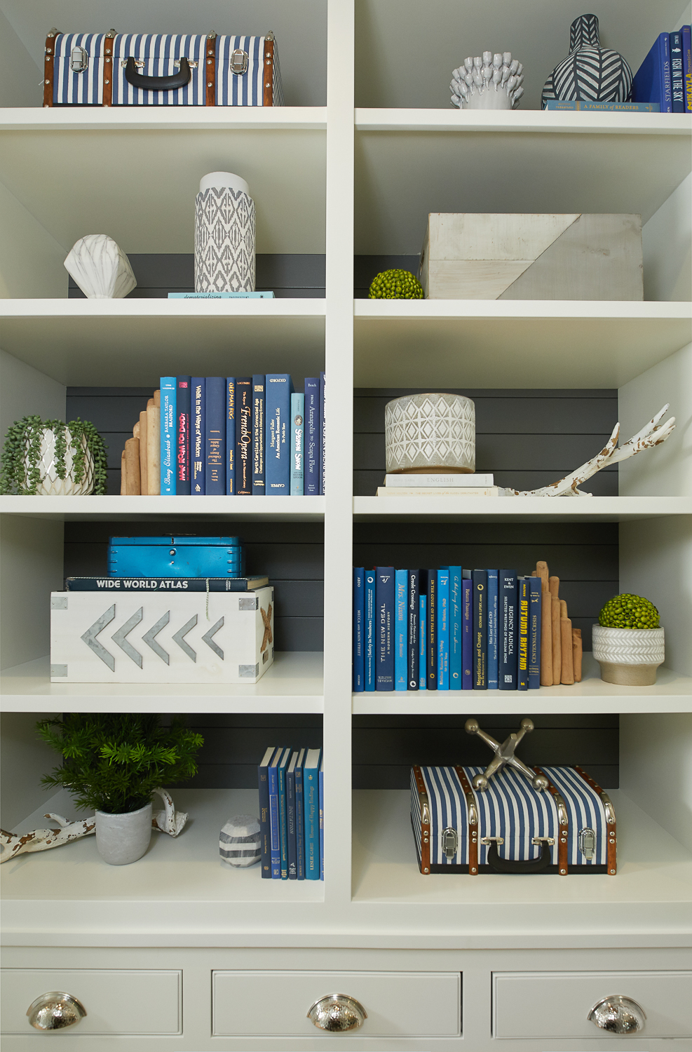
And here's how this space came together. I really like how the charcoal ship lap contrasts against the window frame and the built-in. Again, the knotty alder ceiling is the bomb dot com, and I want it in every room of my own house.
Just past this area is the entrance into the master suite as well as the south stair. The lighting in this space is really fun, and the view is amazing.
I designed this railing so that the wires literally go through the X's rather than in front of or behind like other designs I've seen. It gives it a much more custom look - even though the (super talented) trim carpenters were not thrilled with me.
I'm very pleased with how these spaces came together; the combination of glamour and rustic was a fun style to design with. I love that even though the kitchen is white, it has so many other textures and materials that it doesn't feel like a typical stark white kitchen. These spaces are definitely going to be loved on by this family for many years. Up next is the master suite, so stay tuned.
