


Here at Fuchsia Design, we’ve done our fair share of deep renovations and new construction homes. However, this house was a new ballgame for us; a brand new home that needed a lot of love. Originally, the house was built as a spec house — which means the builder didn’t have a buyer when building it — so not only did he not want to make the design super specific in taste, but he also didn’t want to spend too much money on unique features and risk losing money in the sale. What was the new homeowner left with? … A quality-built, brand new boring home. All of the trim details in the home were very plain, the lights lacked interest, and there were no “wow factors." Furniture can certainly provide a certain level of appeal to a room, but the bones of a home really shape the overall feel of a space.
Luckily, the clients were looking to add some pizazz to their new home, so they hired Fuchsia Design and Scott Christopher Homes to execute the ideas and construction.
We started with the living room.

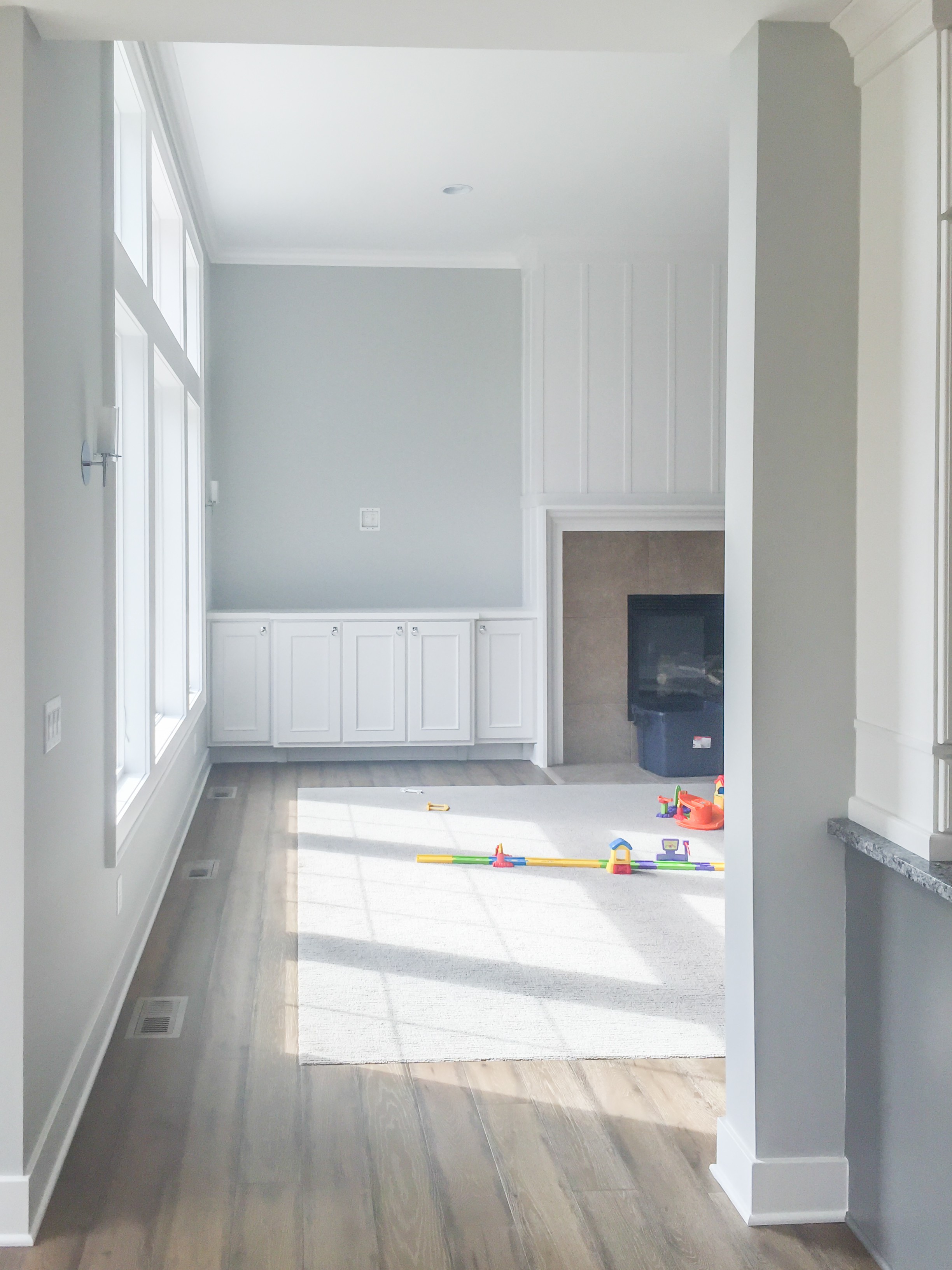
The existing fireplace was a good size and was appealing and appropriate to the space, but the 24"x24" beige tile surround felt completely wrong for the style of the house. Also, the front foyer opened right to the main staircase, and there was nothing especially interesting about the space. Next to the fireplace, there was a nice built in credenza, but it felt like it was missing its top. Finally, the big box store ceiling fan in the space was not cutting it.
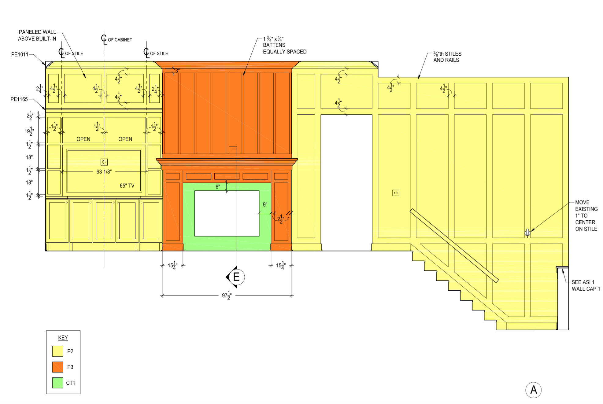
We decided to build out the opening into the master vestibule and do a full paneled wall down the entire stairway. By adding a contrast color to the fireplace along with a mosaic tile and new lower-half mantle, we tied the gray kitchen cabinets into the space and gave the feature piece a more appropriate style for the home. The built-in credenza also got a new top that houses the television and some decorative glassware -- a great place for the homeowner to display a treasured heirloom vase. The chandelier really pulls everything together and makes the room pop.


In the dining room, there was no hanging light above the table, so it hardly felt like a dining room.

This oversized crystal chandelier was a huge statement piece. The walls felt boring, so we cased out the entrances into the living room and did vertical batten strips on all three walls. Pops of blue in this space tie it to the palette in the living room, while the tufted chairs and wood tones in the trestle table and bench keep it feeling cozy and warm.


The homeowner works from home, so a functional and well-design office was a must. The before photos? Pretty boring...

We knew that a large built-in desk with lots of storage would be a great functional feature piece on the main wall. Also, we designed it in a way that it looks built in, but it can actually be disassembled into 5 pieces. So, should they ever move, this awesome desk can come with them!


The area provides versatile seating options while working, and the a fun blue desk is a great craft corner for their son.

When I walked into the powder bath for the first time, I literally felt sad. Powder bathrooms are the PERFECT place to do something fun, unique, and unexpected. It’s a small room with a door, and a great space to surprise guests when they come into your home. However, this brand new, never-been-used powder bath was dark and dull.

We added wainscoting paneling around the entire room with inlayed mosaic tile and a built in mirror. In addition, we added recessed can lighting and new countertops. Now it feels like a real powder bath.


The master bathroom was pretty good, but there were some weird things happening with proportions in the space.

We added this trimmed out mirror with recessed panels for the new wall sconces. It highlights the tall ceilings much better, and feels more appropriate to the room. The mosaic tile backsplash was the perfect alternate to the typical 4" stone backsplash.

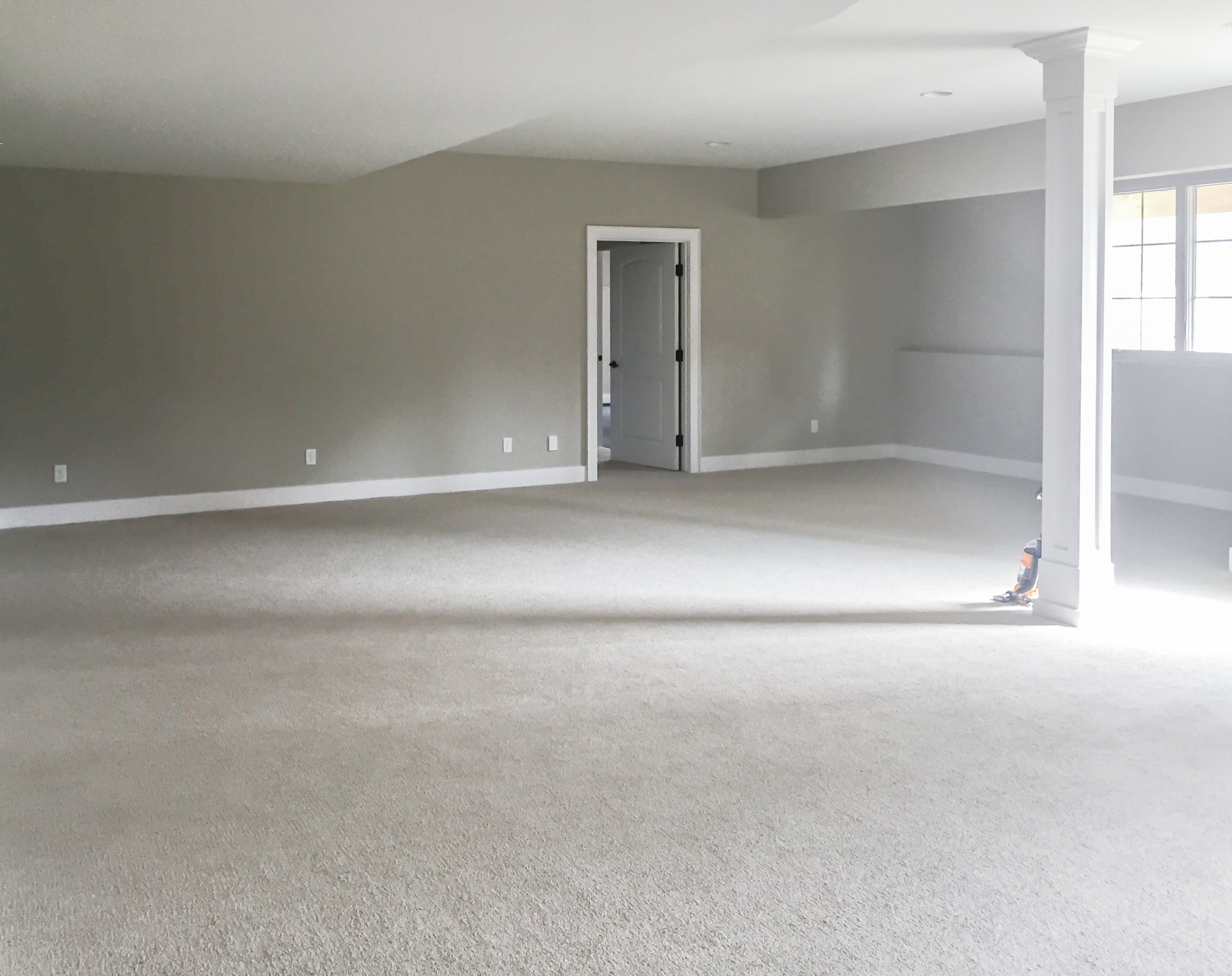
In the lower level, this existing sectional was the only furniture piece the client wanted us to work around. They knew they wanted a comfortable lounge area to watch TV. A large media cabinet with tons of storage was the perfect detail to bring the space together.


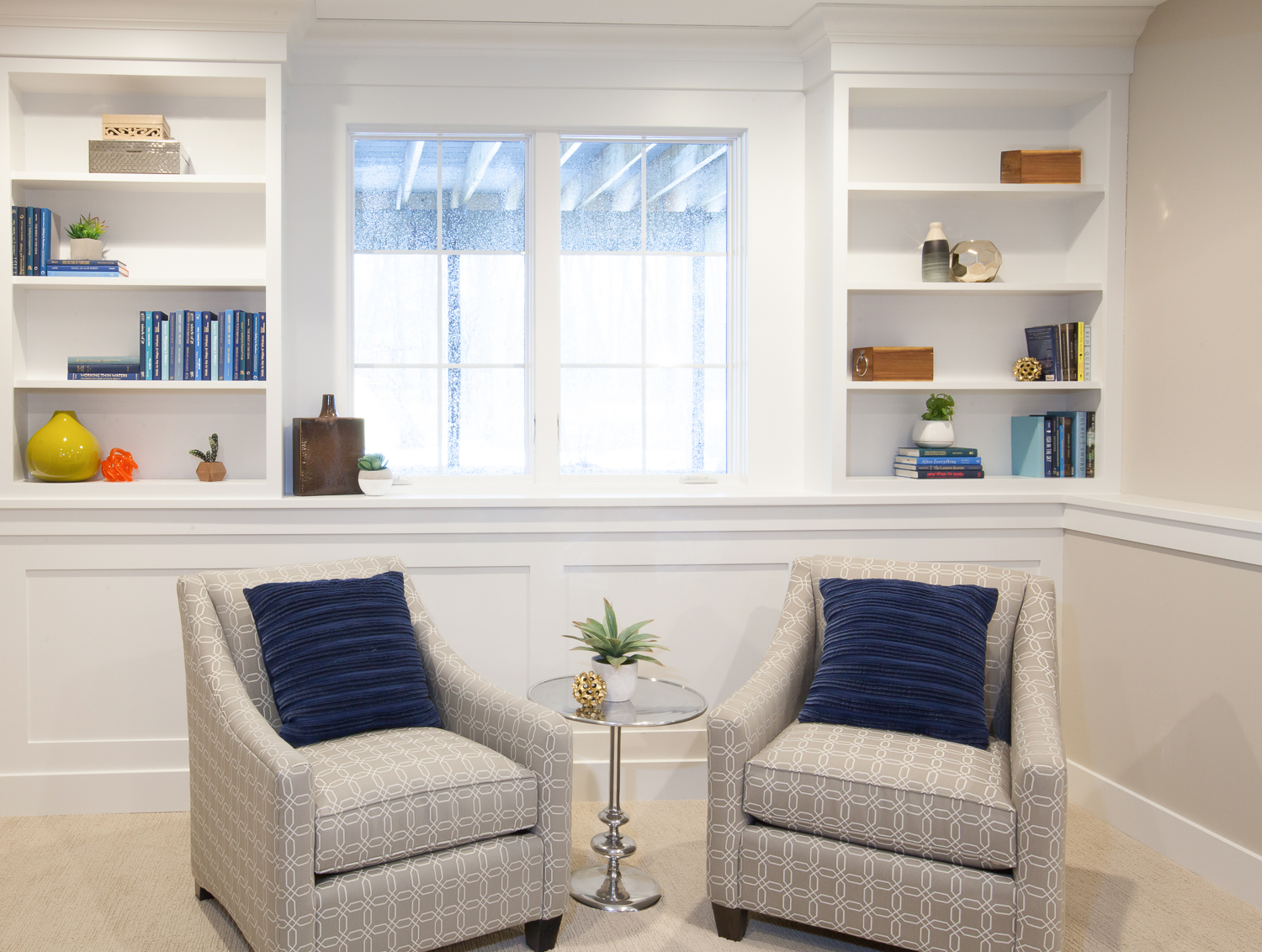
Behind the sectional was an awkward bumped-out dead space that we decided to transform into a reading corner, so we added built-in bookshelves above the existing foundation wall ledge and added wainscoting beneath. With the window, it’s now the perfect corner to sit and read a book.
So, there you have it! Another project in the books, and another beautiful home. I'm so thankful for fun clients that are open to ideas and introducing color and unique details into their spaces. I'm also grateful for an amazing team of contractors to execute my designs flawlessly alongside wonderful vendors.
Builder: Scott Christopher Homes
Furniture: Talsma Furniture and West Elm of Grand Rapids
Accessories: Homegoods, World Market, Talsma Furniture, Stonesthrow Living
Cabinetry: The Custom Shop (a division of Scott Christopher Homes)
Painters: Hedke Painting
Electricians: Rescom Electric