While new construction projects definitely take up a majority of what we do here at Fuchsia Design, I do take on renovations when I know that the client will be able to fully benefit from our wide range of expertise in custom design, construction, and interior architecture. This project fit right into that category.
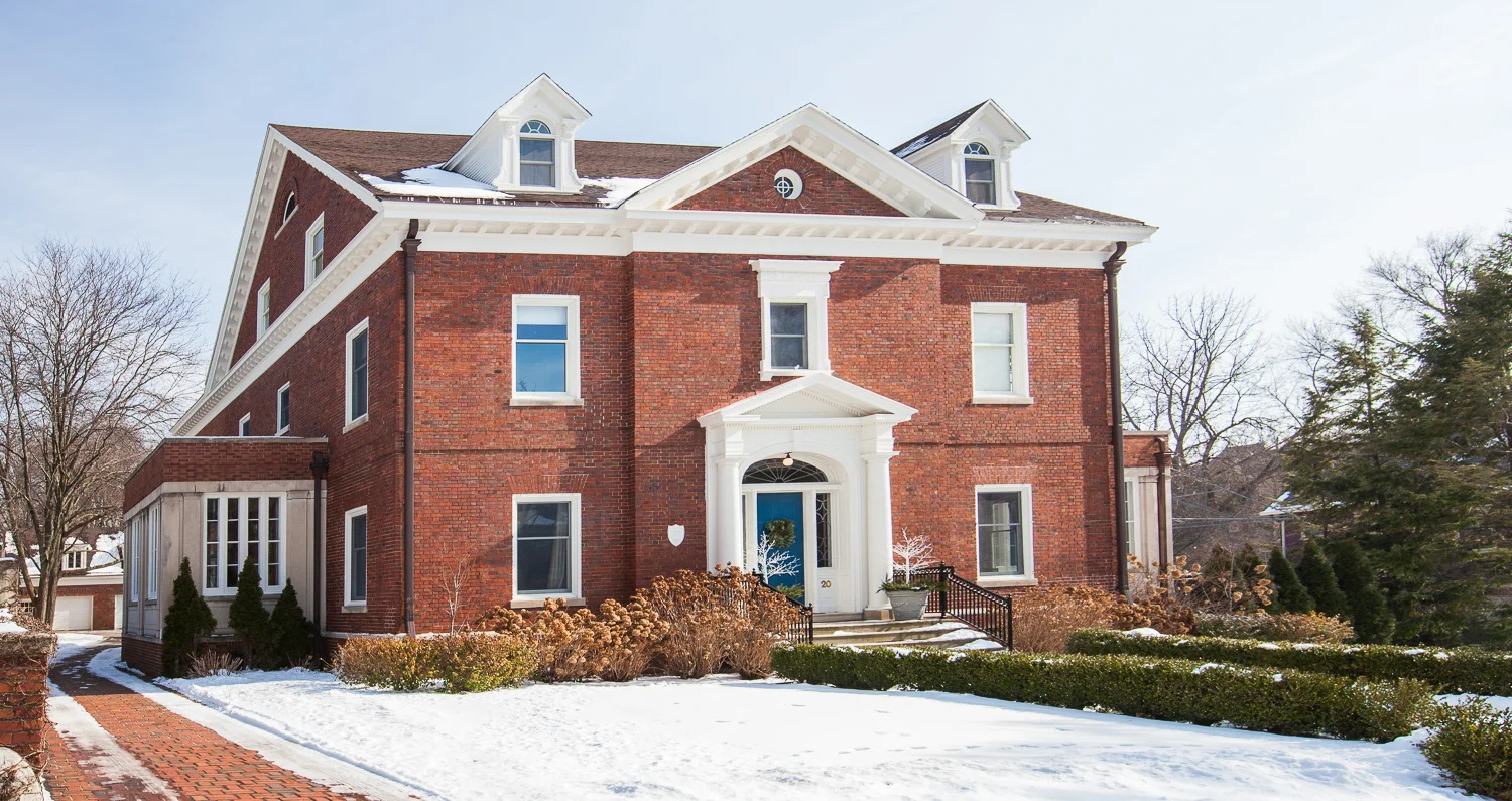
Built in 1905, this gorgeous home has maintained it’s original character for over 100 years. When our client decided to remodel the entire master suite, there was no question that we wanted to try to preserve that level of detail while also introducing timeless yet contemporary elements. When we started the project, there was a nice sized bedroom with a fireplace, a small cedar lined closet, a bathroom with a stand up marble tomb shower, and a large sleeping porch (labeled 'Office'). Back in the day, the sleeping porch was used in the summertime for sleeping. Being that there was no air conditioning in 1905, a room with three walls of windows allowed for lots of air circulation and comfortable sleeping at night. It makes my heart happy to think of all the years of memories this house has seen in the past century.
The homeowner was using the sleeping porch as a home office, but because it didn’t have HVAC, it couldn’t be used in the wintertime. The goal was to insulate and add heating and cooling so the space could be better utilized as a walk-in closet.
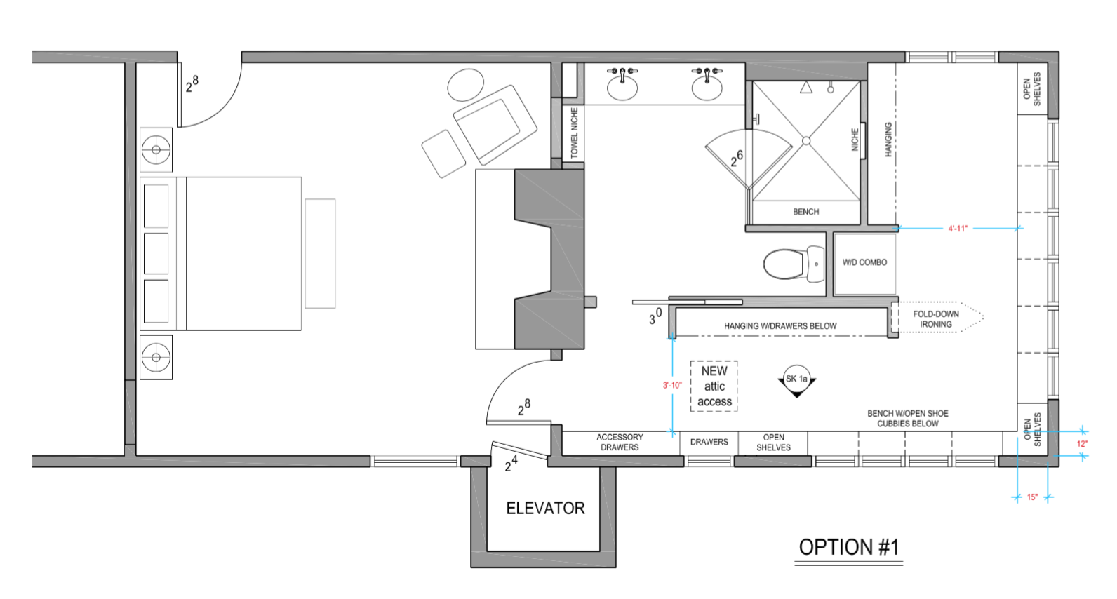
During our typical design process, we begin by space planning several different layouts for the client to consider. In this case, we came up with 6 different plans.
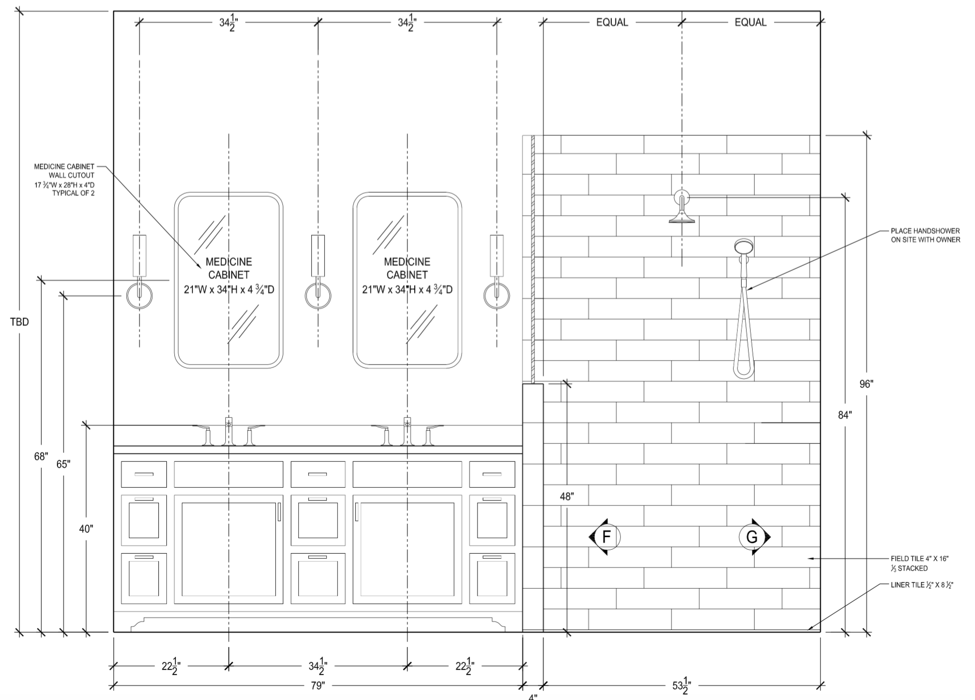
Ultimately, option 1 was selected. From there, we detail out all of the elevations, dimensions, electrical plans, plumbing diagrams, tile diagrams, etc. These drawings are what the contractor uses to price out the project, so we spend a lot of time including as much detail as possible.
Originally, the bedroom was pretty dark and dated – not in a timeless way, but in a “this needs an update” sort of way.
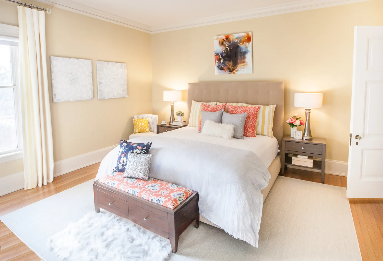
With the new design in the entire master suite, we wanted to keep it light and airy. We worked with a soft palette of blues, coral, yellow, and white.
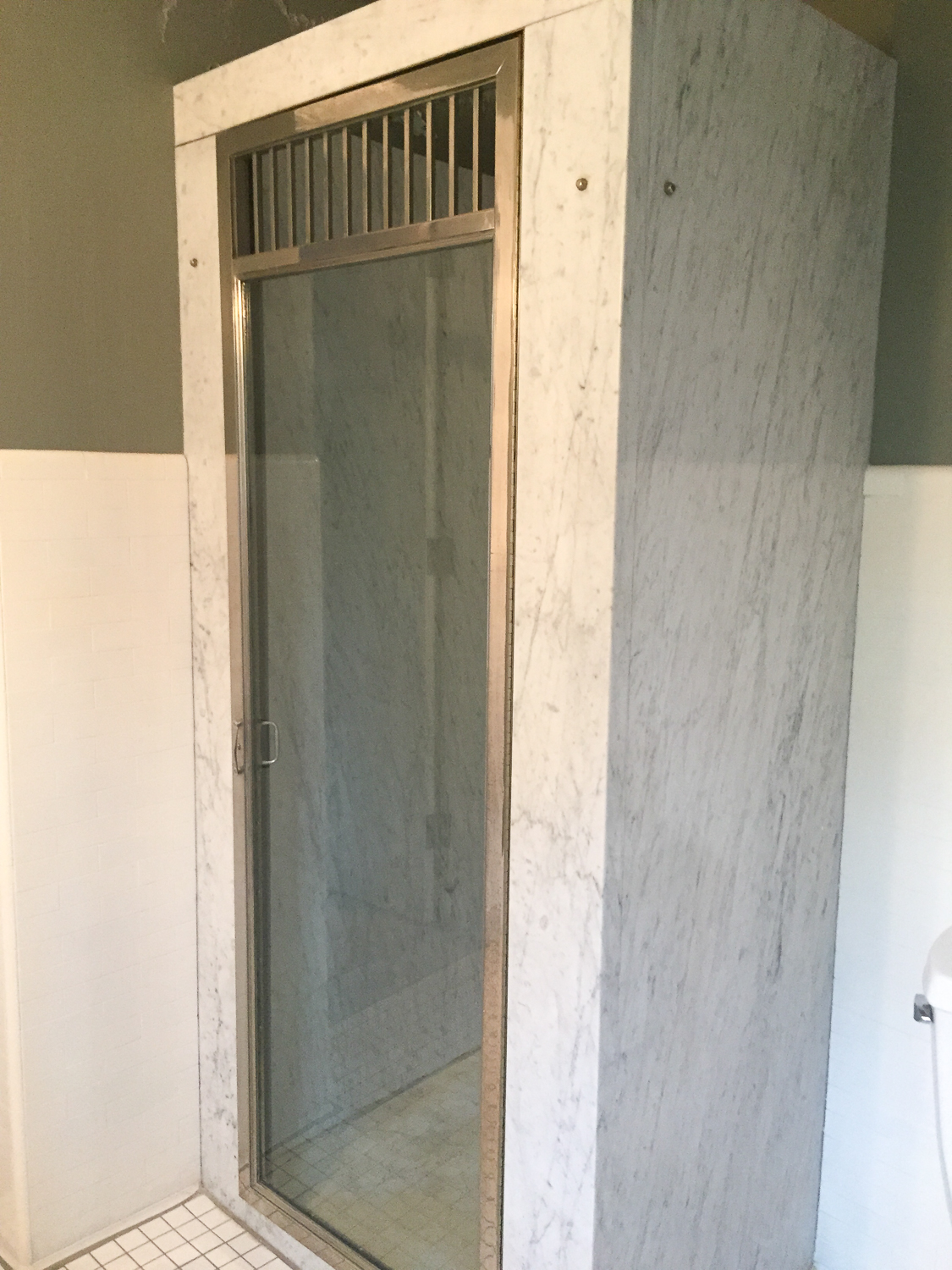
In the original bathroom, there was a marble tomb shower date stamped 1910. (EEK! How cool is that!?) Marble is rarely a good idea in a bathroom because it is very porous and can easily be stained by shampoos, cleaners, and hard water. While the interior of the shower wasn’t in great shape, the exterior was in great condition considering it had already live 100 years of life in this house.
As you can see below, the fireplace surround in the bedroom had been ‘updated’ with an ugly green granite – likely back in the 80’s or 90’s. It also had sage green trim details to coordinate to the walls. The homeowner came up with the idea to repurpose/reuse the marble from the shower into a new fireplace surround, and I LOVED that idea! Even better, we were able to save the original shower door and pass it along to another home in Heritage Hill to be reused in their shower. Landfill saved!
Above you can see the original fireplace and shower. Below is the repurposed marble in the existing fireplace.
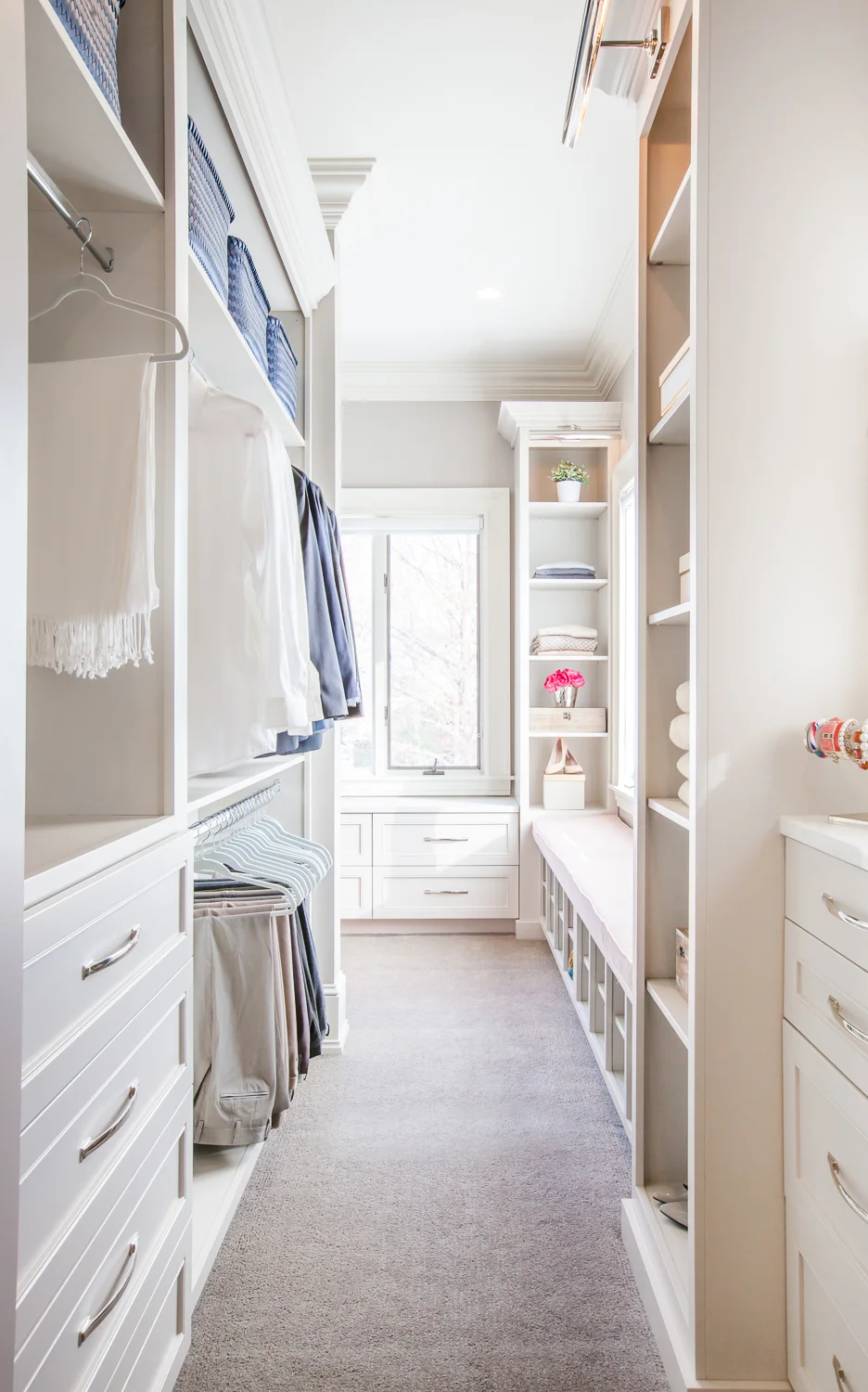
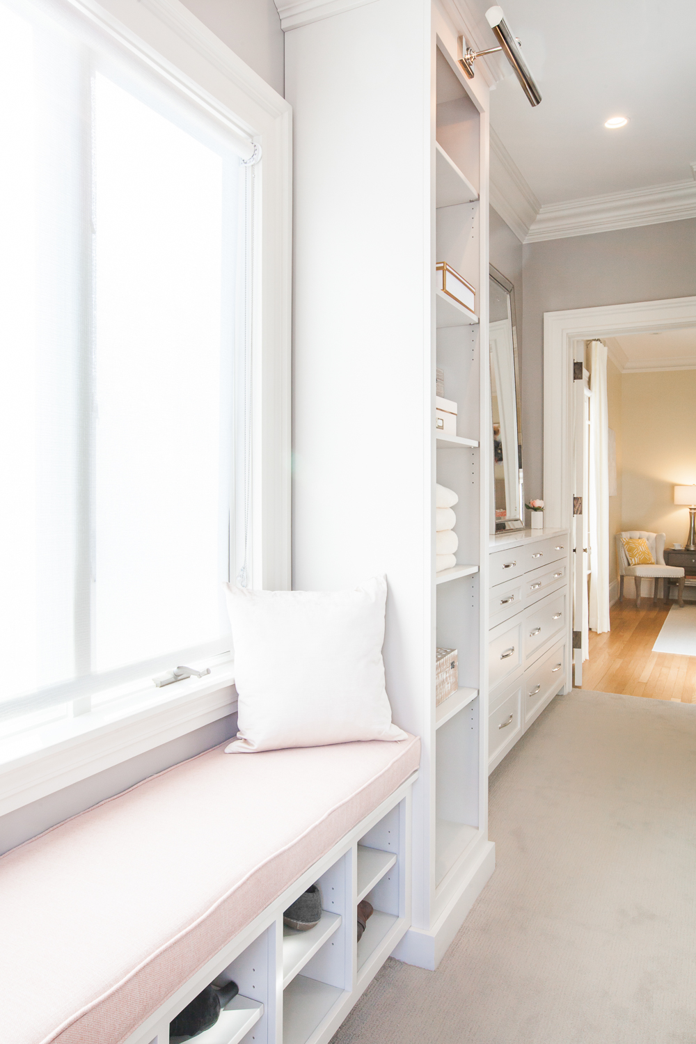
The master closet is a huge improvement from what used to be there. The existing closet was a much smaller, cedar-lined closet. While cedar lining was originally used as a way to protect woolen clothing, there are better ways to accomplish that in today’s day and age while incorporating a brighter palette and design. We also utilized most of the space from the original sleeping porch/office for the walk-in closet.
If you reference option 1 space plan (above), you can see that we landed on an ‘L’ shaped closet with tons of storage.
Woodways Custom Cabinetry supplied all of the cabinetry for this renovation, and the end result is beautiful. My favorite details that we incorporated into the space are the library sconces on the tops of all of the towers and all of the natural light.
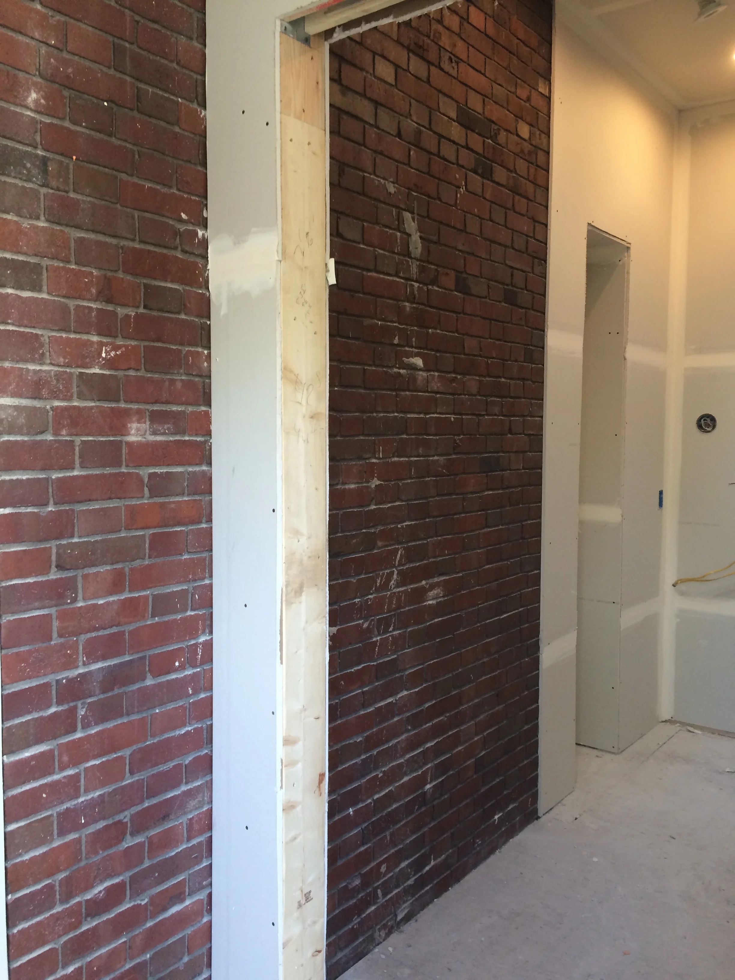
Sneak peek at the exposed brick mentioned below. Keep reading! ^ ^ ^
You’ve seen some hints of photos of the original bathroom above, but here is what the bathroom looked like before we worked our magic.
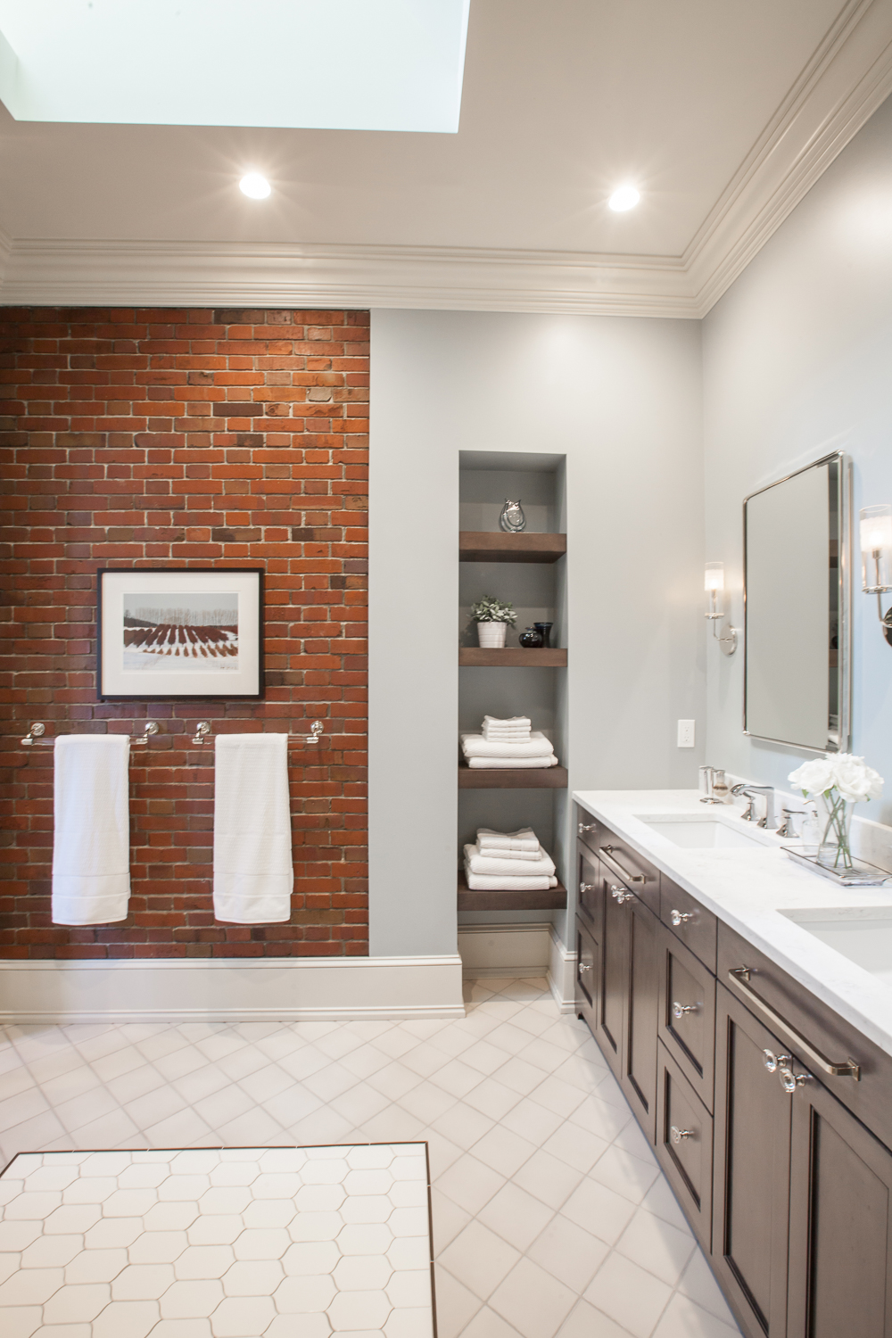
One of the best and worst parts of a renovation is that you never know what you’re going to find when you open up the floor and walls. Sometimes you find mold. Sometimes you find dry rot. Sometimes… you expose the entire backside of a gorgeous brick fireplace shaft. It’s like playing the lottery, and in this home – we won! The brick was even in amazing condition and needed very little restoration.
Below is the final design. The chocolate stained maple looks like velvet in person. Even though it’s dark compared to the rest of the space, it’s such a soft element to the design.
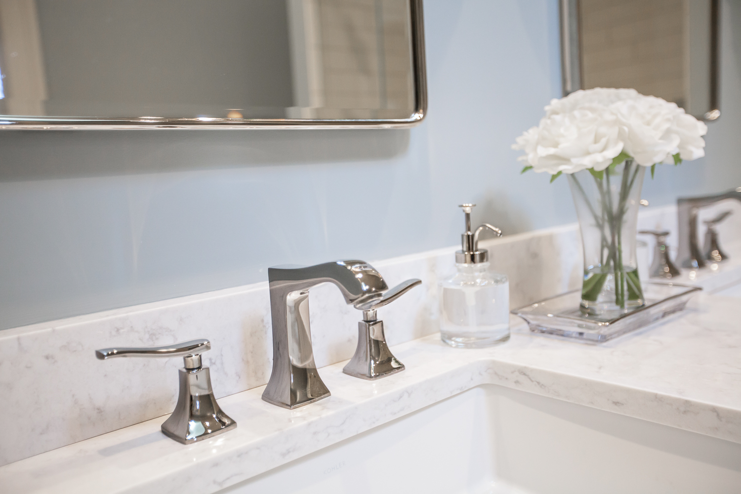
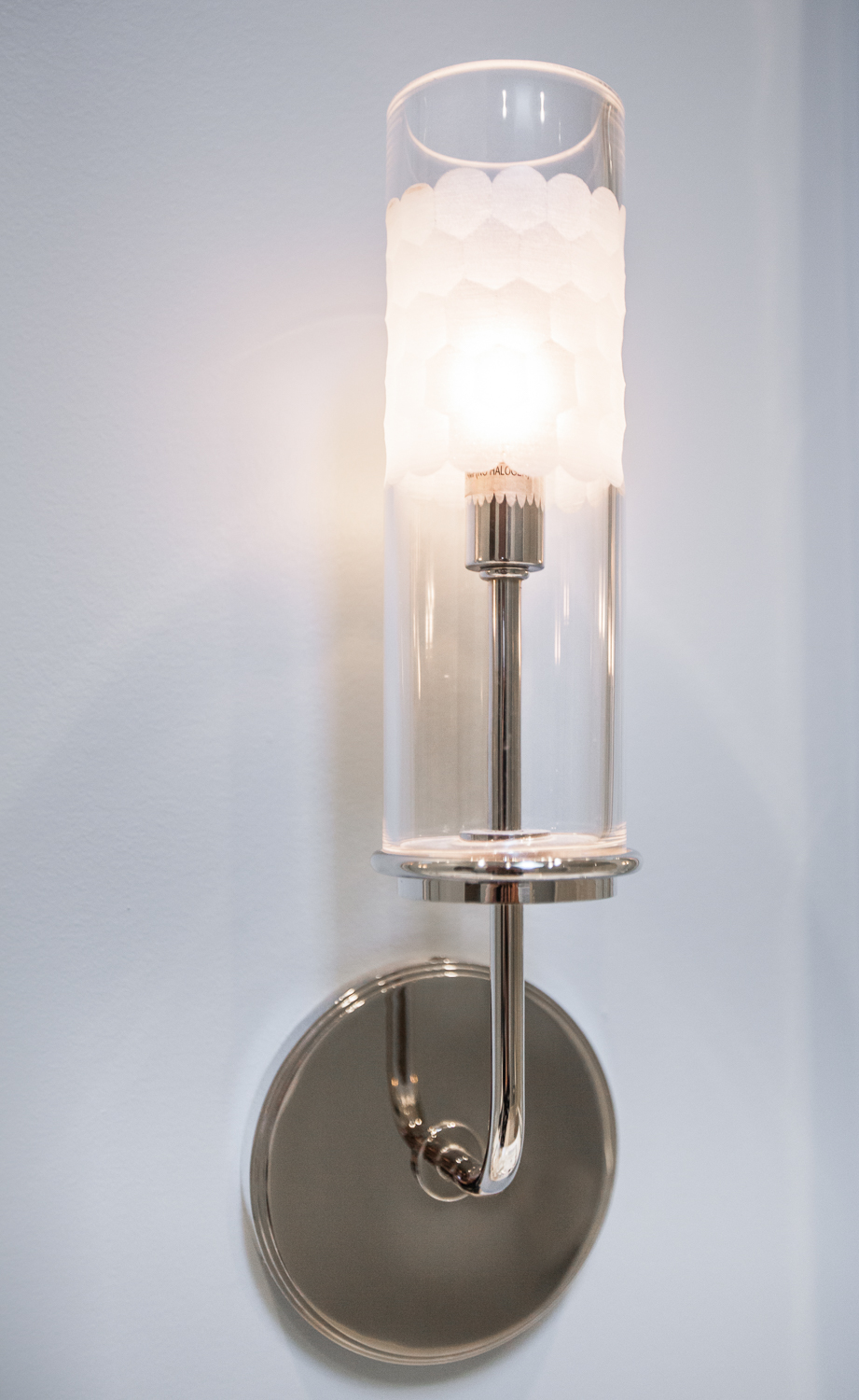
While subway tile is a classic look, we opted for large subway tiles to keep it more contemporary while still maintaining a classic 1/3 offset install. Blue walls were a beautiful compliment to the brick wall, and the polished nickel details (plumbing, lighting, and hardware) give the room a hint of glamour.
Because all of the windows are in the closet, we opted to raise the ceiling and include a skylight to let natural light in. In addition, we used a pocket door with frosted glass so that light filters in when the door is open and shut.
This was such a fun project. I’m so grateful to have worked with a client dedicated to preserving the original character of the space and who was confident in the styles and details she loved. For a list of the amazing vendors, see below!
Builder: Paradigm Renovations
Cabinetry and Countertops: Woodways Custom Cabinetry
Tile: Virginia Tile
Plumbing: Ferguson Enterprises
Carpet: Prosource
Bedroom Draperies: AdiDesign
Furniture: Room and Board
Artwork: Lafontsee Galleries


