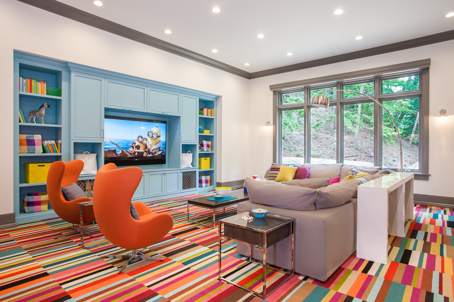
While most of the photographs from the lake house won’t be ready for a few weeks, I got the kid's media room photos back, and I couldn’t wait to share them!
This room is in the first level of the lake house and will serve as a hangout spot for the client’s three children ages 7, 9, and 11. It’s also a great place for the family to watch a movie, and as the kids age, this will be an awesome place for them to spend time with friends.
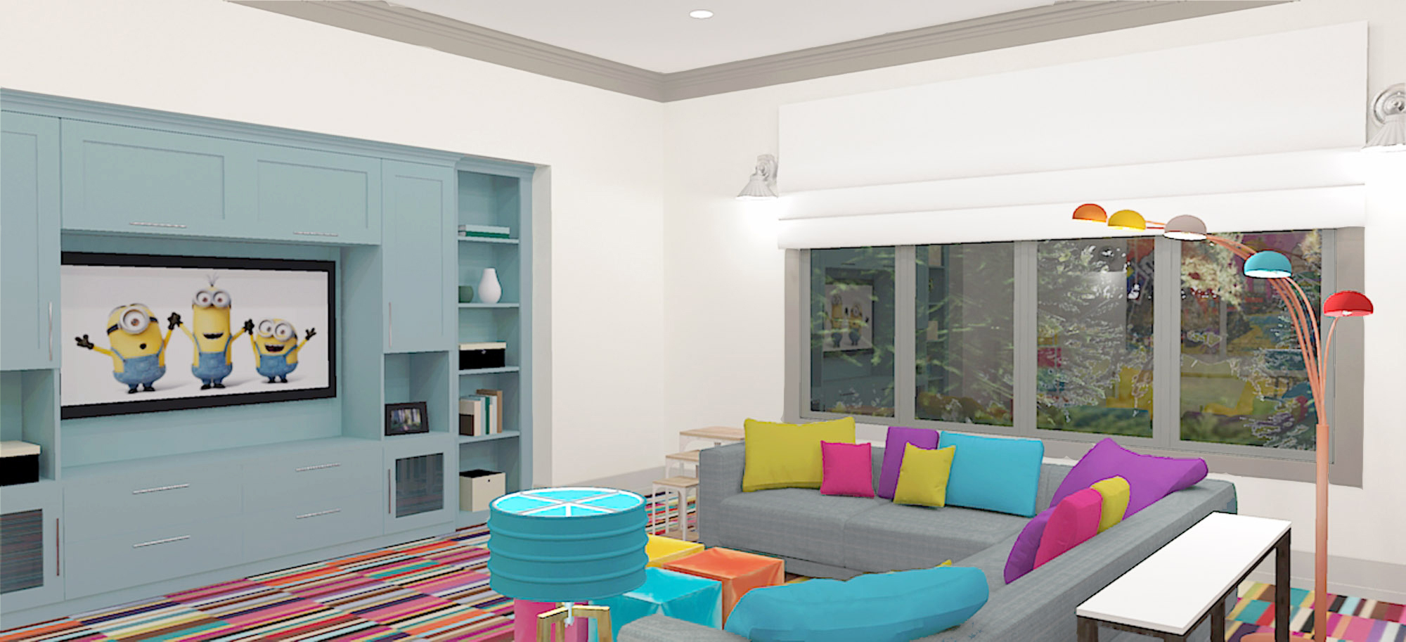
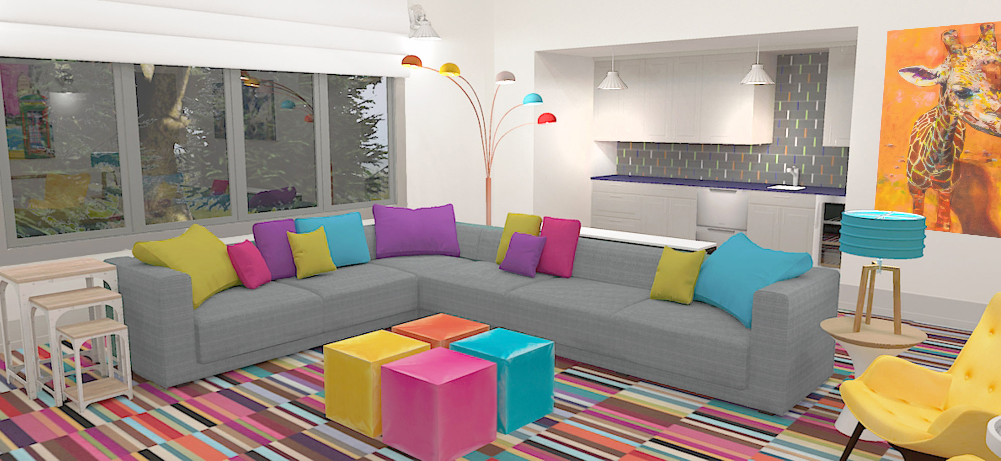
Right off the bat, the client provided me with feedback that they liked the idea of incorporating color into this space, and they wanted it to be a fun room. I knew immediately that I wanted to create a pattern on the floor using FLOR carpet squares. They’re the perfect solution for a high traffic room or a room with lots of kid activities because if one gets stained, you just pull it up and put another one down! So, I selected 4 different colorways of these striped tiles (installed in a random pattern) and drew my inspiration for the rest of the room from there. Below are a few of the concept renderings that the client approved in the beginning.
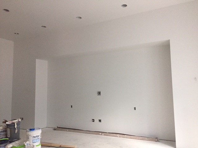
From there, construction could continue in the space once we determined the heights for bulkheads, the electrical needs in the space, lighting layout, media requirements, and a snack bar layout.
Media Wall Progress Shot
Snack Bar Layout
Snack Bar Progress
The sectional is from the Cloud Collection at Restoration Hardware, and it literally feels like sitting on a cloud. You completely sink into it, and while the cushions will never look perfect from kids sitting on them, THAT’S OKAY! It’s a playroom! It should look lived in! We used fabrics that will wear well with kids and incorporated tons of storage for toys, DVD’s, and books.
Bekins did all the automation in the home, and the large windows have power shades that can easily be lowered for the full move theatre experience.
One of my favorite local artists is David Warmenhoven. I’ve used his pieces in two projects in the past and a large turtle painting of his hung over my desk at my last job before starting Fuchsia Design. I knew after selecting the FLOR carpet squares that we needed to have a few of his pieces commissioned for the space. Of course, I love his use of color and all of his paintings are HUGE which was perfect for the scale of the room with the 12’ ceilings. We decided to have him paint a giraffe and an elephant, and I love how they turned out!
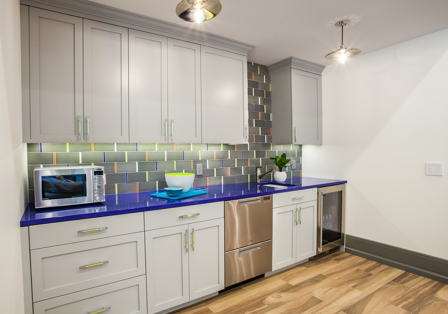
The snack bar is the perfect addition to the space. With the kitchen being 2 floors away, it’s a great place to grab a drink or pop some popcorn while watching a movie. The dishwasher drawers are easy for kids to use, and I’m 100% obsessed with how perfectly the cabinet pulls coordinate to the backsplash. The backsplash color combination is a custom blend from Pratt and Larson. They have tons of colors to select from, and I selected this combination to coordinate to the carpet tiles and the blue Cambria countertop. I truly find so much joy in integrating color into the spaces I design.
I love how this space came together, and it makes me so happy to think of all the fun times that will be had in this room.
More lake house coming soon! Stay tuned!
